The 2023 MLS Kit Renaissance, Part 3

By Edgar Zuniga
After going from 30 – 21 and 20 – 11, we finally get to the Top 10 kits of the 2023 Major League Soccer (MLS) season. Not only are these kits exceptional and creative, some of them are beyond what anyone expected. Whether it be through impressive artwork or subtle yet poignant statements, these are going to be some of the better kits to ever hit an MLS field.
10. DC United – Cherry Blossom

DC United’s kit game is perennially strong. They have set the standard from the very beginning of MLS and you’ll be hard pressed to find a mediocre DCU kit.
If you’ve never been to the US capital, Washington, D.C. is famous for its cherry blossom trees, which have become a symbol of the District of Columbia. The cherry blossoms have found their way onto the uniforms of MLB’s Washington Nationals and the NBA’s Wizards to massive appeal.
Now, D.C. United has one to call their own and it is superb. Legendary DCU play-by-play announcer (“It’s in the net!”) and Sports Director of WTOP Radio (Washington, D.C.) Dave Johnson (@davejsports on Twitter) has nothing but praise for the Cherry Blossom kit.
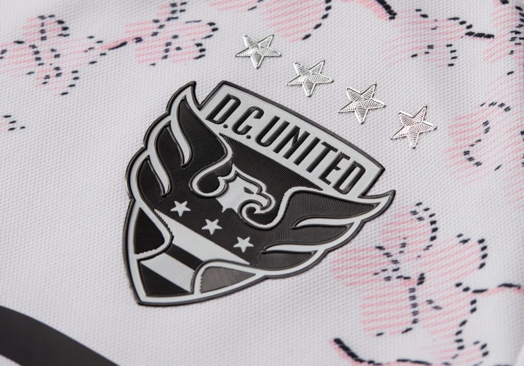
“I love it,” he said. “The Cherry Blossoms are such a part of the city’s identity and now so is DC United. Fans have just gone wild!”
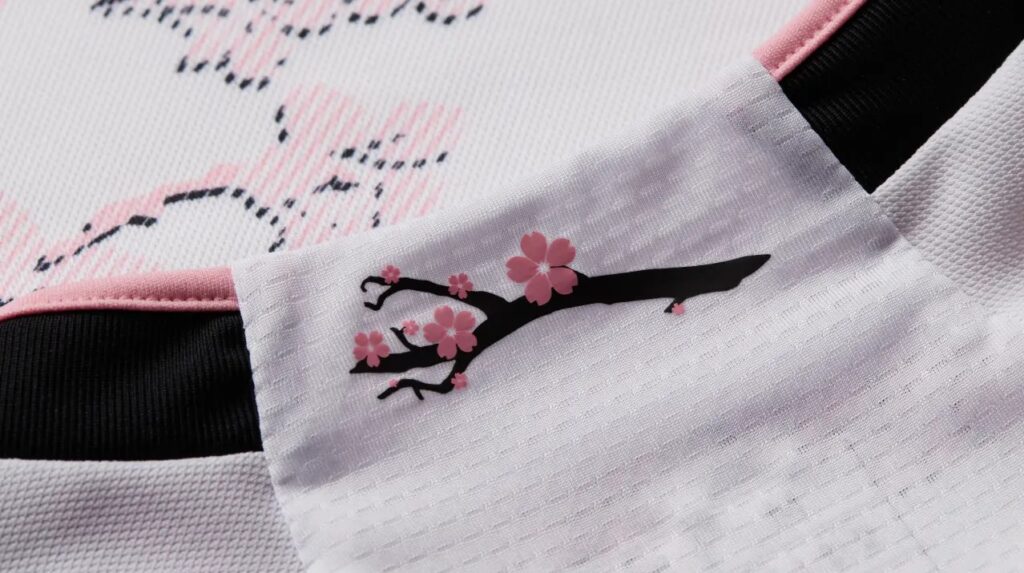
The shirt features a pattered design of branches with cherry blossoms across the front, a cherry blossom branch on the neck, and the club mantra, “All are Welcome, All are United,” found embossed along the black hem of the shirt. The only reason this kit isn’t ranked higher is that the design of the cherry blossom branches almost fades into the soft pink body of the shirt. Nevertheless, a beautiful new addition to the pantheon of great DCU kits.
9. Houston Dynamo – El Sol

It’s hard to ruin orange and Houston Dynamo FC have never failed in that respect.
While there was nothing wrong with their 2021-22 primary kit, it was very simple in design. For 2023, Houston Dynamo went for something more luminous with their El Sol Kit, which the club says “celebrates the energy, light and guidance sourced by the Sun with a Texas twist.”
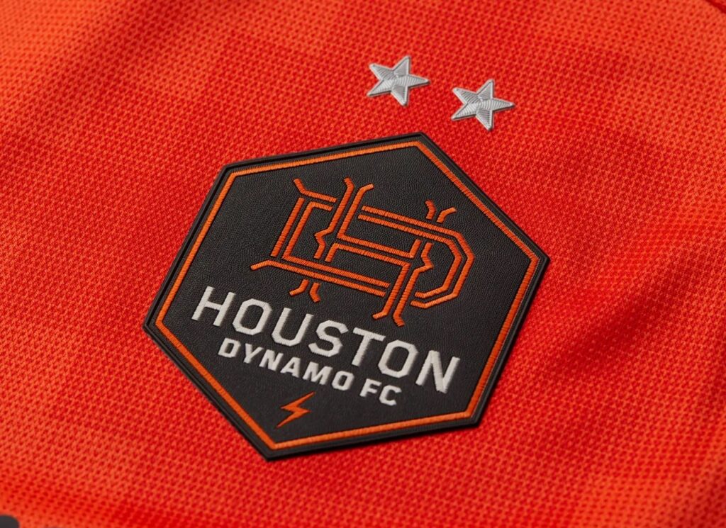
Instead of one shade of orange, El Sol gives us a range of various hues, with a digital hexagonal pattern, looking much like a heat map. If you’ve ever been to Texas in the summer, you understand what Texas heat is all about. The club’s interlocking HD can be found within a silhouette of the state of Texas on the neck and the black striping on the shoulders and the black side-seam and hem, make the orange pop even more.
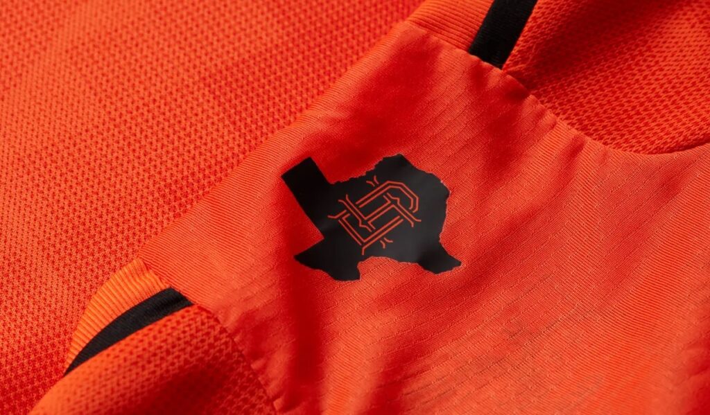
For Finnister (@DynaPod on Twitter), host of the Houston Dyna Pod, El Sol gets his nod of approval. “It’s different,” he admitted. “I think it’s cool with the pixelated Roblox look, but you can’t beat that Bayou City Kit or the Sunrise Kit from two seasons ago. Some don’t like it, but you can’t make everyone happy. Overall, the reception has been good. I’m a fan of it.”
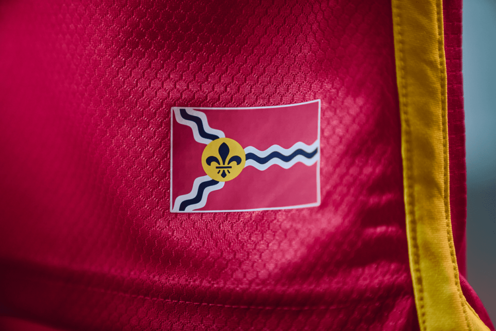
8. St. Louis City SC – CITY

If you’re going to make a first impression, make sure it will stand the test of time. Although they whiffed with their unremarkable secondary kit, St. Louis SC had already unveiled their primary in November to league-wide approval.
Like LA Galaxy’s LA Kit, The CITY Kit also pays tribute to its local flag, blending the club’s signature CITY Red color, with navy and yellow accents from the flag of St. Louis, which was used for the jock tag.
On the inside of the neck, there is an inscription that reads, “Our City Our Home.” However, the most distinctive feature of the CITY Kit is the use of a geometric pattern on one half of the shirt that depicts the steel plates of the Gateway Arch monument.
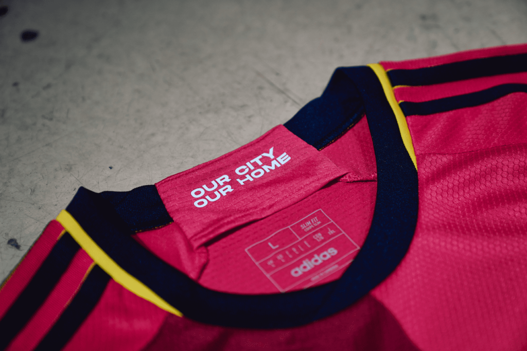
The only issue with the CITY kit is the Purina sponsor checkboard logo, which clashes with the design on the shirt. Otherwise, for an inaugural kit, it’s an instant classic.
7. Real Salt Lake – Beehive State

Finally rid of their dull 2021-22 away kit, dubbed the Supporter Secondary, Real Salt Lake reached into their coffers, dusted off their golden standard, and gave it an update in honor of their home state.
Utah is known as the Beehive State and RSL’s new kit of the same name celebrates that with an embossed honeycomb pattern on a muted gold background, reminiscent of the revered 2010 Victory Gold Kit that celebrated the club’s first MLS Cup victory in 2009.

A representation of club mascot Leo the Lion wearing a kingly crown can be found on the neck, while highlights in claret red and cobalt blue can be found on the collar, sleeves, side-seams, and hem.
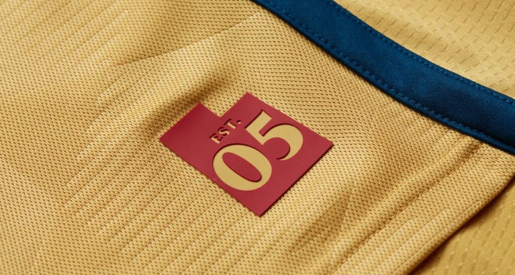
A silhouette of the state of Utah with “Est. 05” can be found on the jock tag, marking the club’s first year in MLS. Overall, it will go down as a timeless kit for RSL and will surely be a hit among fans.
6. New York City FC – Interboro

You gotta give the nomadic Pigeons credit for fully establishing and embracing their identity as a club that represents the Five Boroughs.
While Red Bull New York went with toxic sludge as their theme, New York City FC gives us a rendition of their crest across the front of the Interboro Kit in the same style as the many New York City subway stations that are decorated with colorful ceramic plaques and tile mosaics, many of which have been around since 1904.

Continuing with the theme, a plaque with the team’s full name is positioned on the neck. As a primary, the Interboro Kit is City Blue in color with highlights in navy and orange, colors found on the flag of New York City.
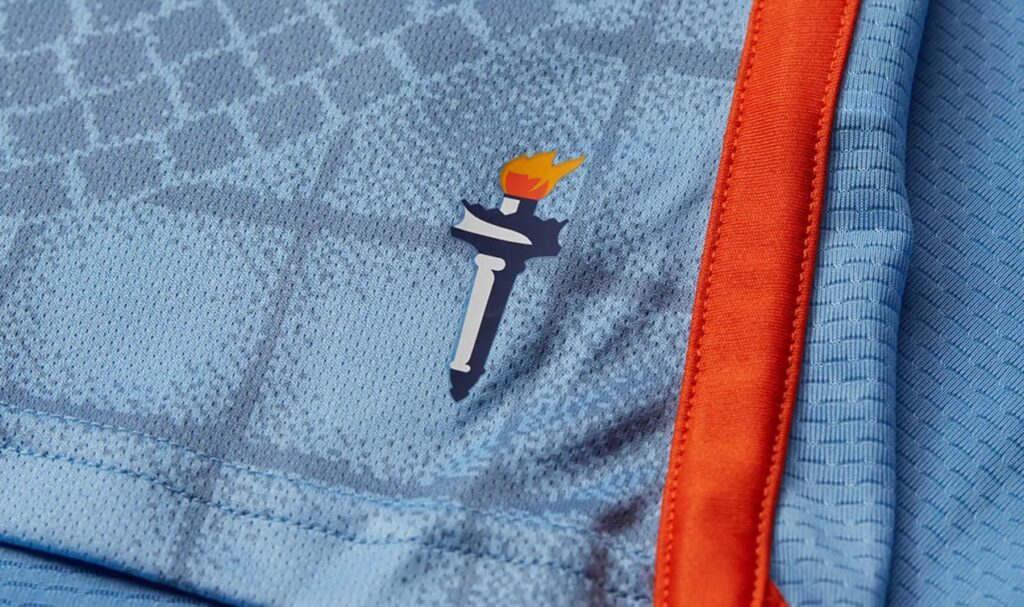
For a jock tag, the kit uses the Statue of Liberty’s torch, which according to the club, was inspired after a workshop with Young Leaders from City in the Community, the nonprofit foundation proudly supported by NYCFC.
5. Atlanta United FC – 17s’

It has only been five years since Atlanta United FC lorded over MLS, boasting themselves as MLS 3.0.
Since then, everything has gone off the rails for The Five Stripes, even the unthinkable (unfathomable) when the King of Atlanta himself, Josef Martinez, left the club and took his talents to South Beach.
So, pardon ATL for harkening back to their inaugural season and halcyon days with 2023’s The 17s Kit, which resembles the stout look of the 2017-18 primary kit. It’s a return to the thick red and black stripes after two years of the odd BLVCK Kit and its stringy thin five red stripes lost in a sea of black.
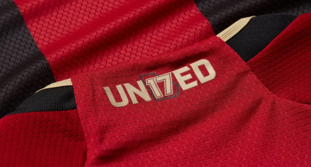
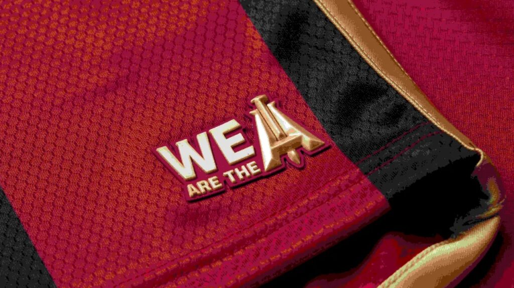
Atlanta United has dedicated the kit to the club’s supporters, who are known as “17s,” and a “UN17TED” wordmark centered over an outline of the state of Georgia can be found on the neck. Meanwhile, the jock tag asserts “WE ARE THE A” with a rail spike through the A.
Atlanta United fan Josh Simmons (@JoshSimmons33 on Twitter) appreciates the new kit. “They remind me of our original kits that I thought were the best, but just with a bit of a twist. A 9 out of 10 for me,” he said. The 17s Kit has been an immediate hit with other ATL fans, as well. “I haven’t met an Atlanta fan that doesn’t like it,” Simmons added. “We’ve been begging for years to go back to our roots from our original kit and this does just that. It’s perfect.”
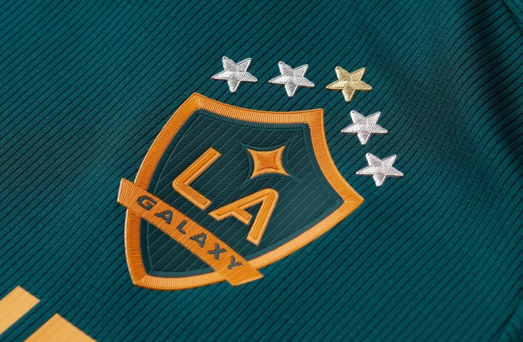
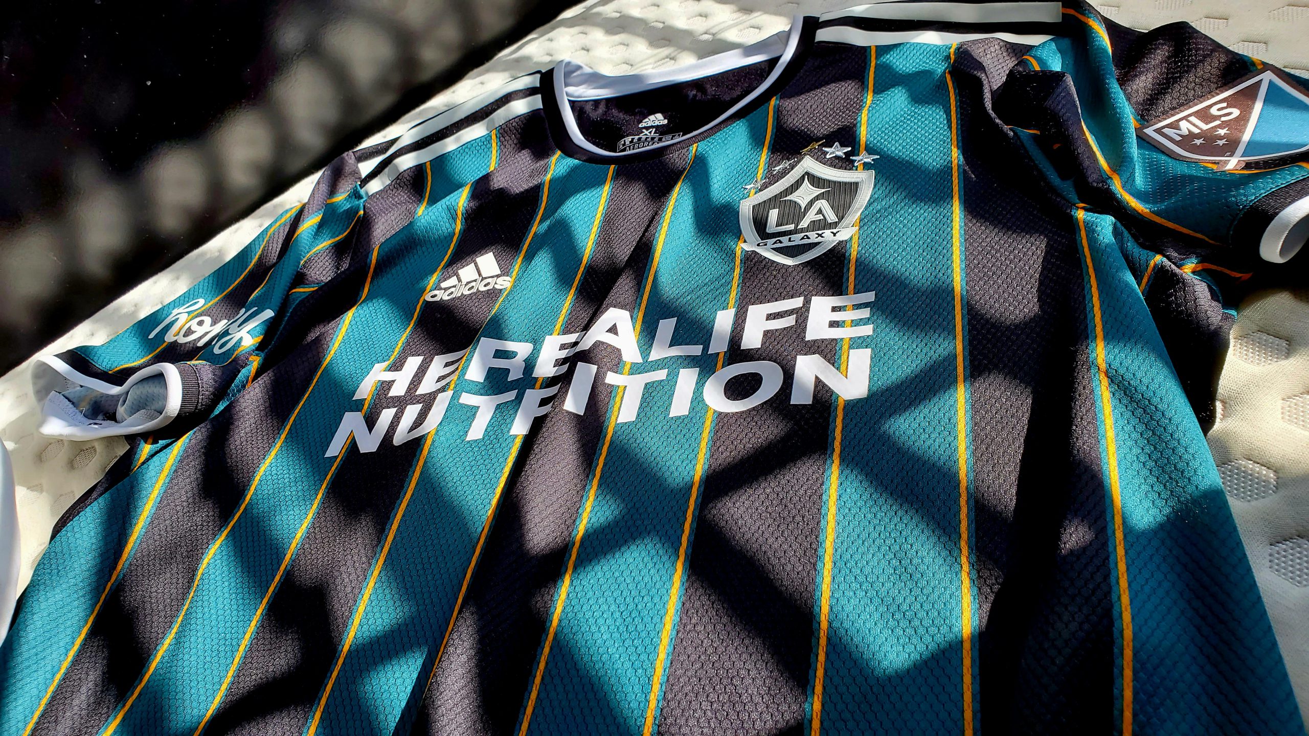
4. LA Galaxy – LA

No way. There was absolutely no way that LA Galaxy could ever top 2021’s Community Kit, which upon launch was hailed as an instant classic and went on to be lauded as one of the best kits in the world.
But they tried. They really gave it their best shot with 2023’s LA Kit, which is completely inspired by the flag of the city of Los Angeles.
The overall color and design of the kit rekindles memories of the original from ’96, the 2000-02 kits—during which the club got their first taste of glory, winning the 2000 CONCACAF Champions Cup, 2001 U.S. Open Cup, and 2002 MLS Cup—and the 2013-14 third kit, the last time Galaxy won anything.
However, the LA Kit stands on its own. The foundation is a green base with the Galaxy crest in gold and green. Gold side-seams spill onto the hem, while red highlights border the upper back of the kit. The most distinctive touch, however, and what sets it apart is the use of the L.A. flag, which has an eccentric design with three vertical stripes of green, gold, and red divided in zigzags.
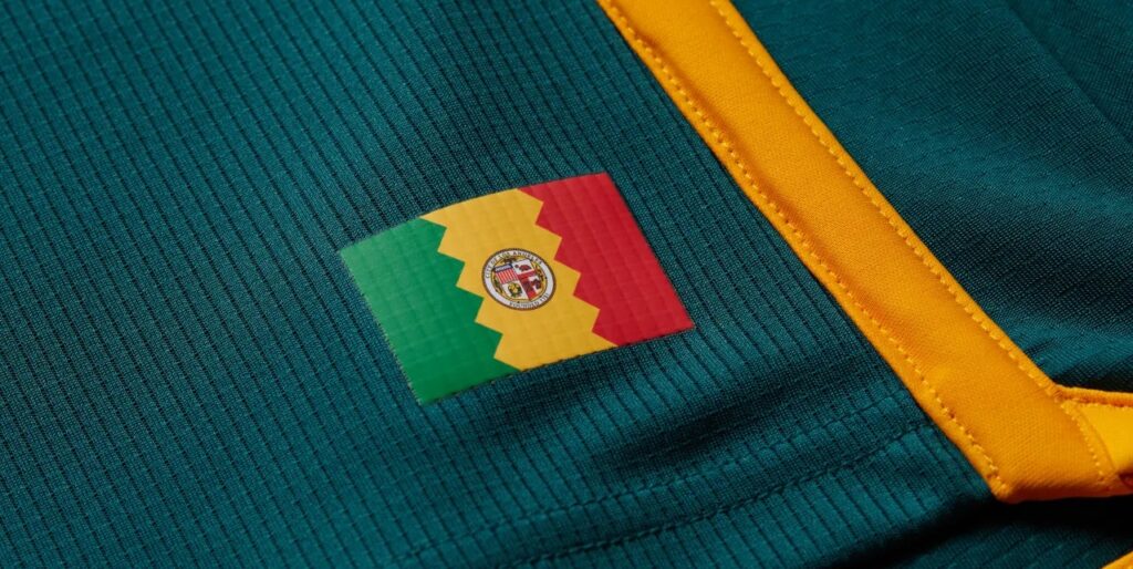
That pattern is prominently displayed on the collar and sleeves of the shirt to great effect. The flag itself can be found proudly displayed on the jock tag, while an “LA” with the Galaxy quasar symbol can be found on the neck.
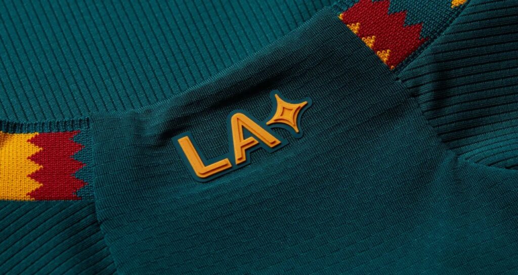
Needless to say, the LA Kit wouldn’t look the same without the five stars above the Galaxy crest.
Although it’s not the ’21 Community Kit, you would think this one would be selling out like its secondary predecessor. But that’s not the case, as Galaxy supporter groups have banded together and declared a protest/boycott against the club due to their frustration and resentment with current LA Galaxy president Chris Klein and refuse to buy any club merchandise.
Many Galaxy supporters feel that Klein views them more as customers rather than supporters and have made it clear to the LA Galaxy front office that they will no longer attend matches until Klein is removed from his position or resigns.
How long this impasse will last is anyone’s guess. But, once the dust settles, you can be sure that the LA Kit will become a big seller and go down as another Galaxy classic.
3. Portland Timbers – Portland Plaid

What is it about the clubs in the Pacific Northwest and their glorious kits?
Portland Timbers is one of those MLS clubs that very rarely if ever stumble when it comes to their kit game. For 2023 they have unleashed an absolute beauty with the Portland Plaid Kit.
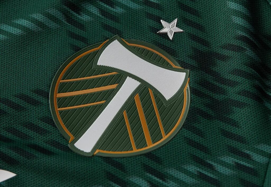
Evocative of the plaid patterns traditionally worn in the PNW by lumberjacks, the Portland Plaid combines luscious ponderosa green, shadow green, and gold with the club claiming this is a representation of “the tight-knit relationship between the club and community.”

Another neat detail is the jock tag, which features a stack of log slices with the club’s name at the bottom and “For the Rose City” arched across the top, all with an argyle backdrop.
However, Portland fans, particularly members of Timbers Army, have loudly voiced their disapproval and disgust with current Timbers owner Merritt Paulson for a variety of reasons, but mainly for his role in the cover up of domestic violence allegations involving former Timbers player Andy Polo and the shocking Paul Riley abuse scandal involving Portland Thorns FC (NWSL) players.
Across social media, many Timbers fans say they love the Portland Plaid Kit but are reluctant to buy it as long as Merritt owns the team.
2. Seattle Sounders FC – Bruce Lee

Fire.
Absolute fire.
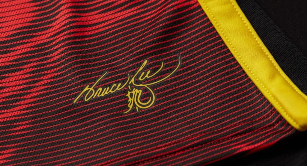
After 2021-22’s popular Jimi Hendrix Kit, Seattle has unveiled another work of art as their secondary, with the exquisite Bruce Lee Kit, which pays a fitting tribute to the legendary martial artist, actor, director, and philosopher.
Lee called Seattle home in the early ’60s and this kit celebrates his contributions to Seattle with a breathtaking hand-drawn dragon design splayed across the front of what is largely a red kit, bucking the traditional look for Seattle.
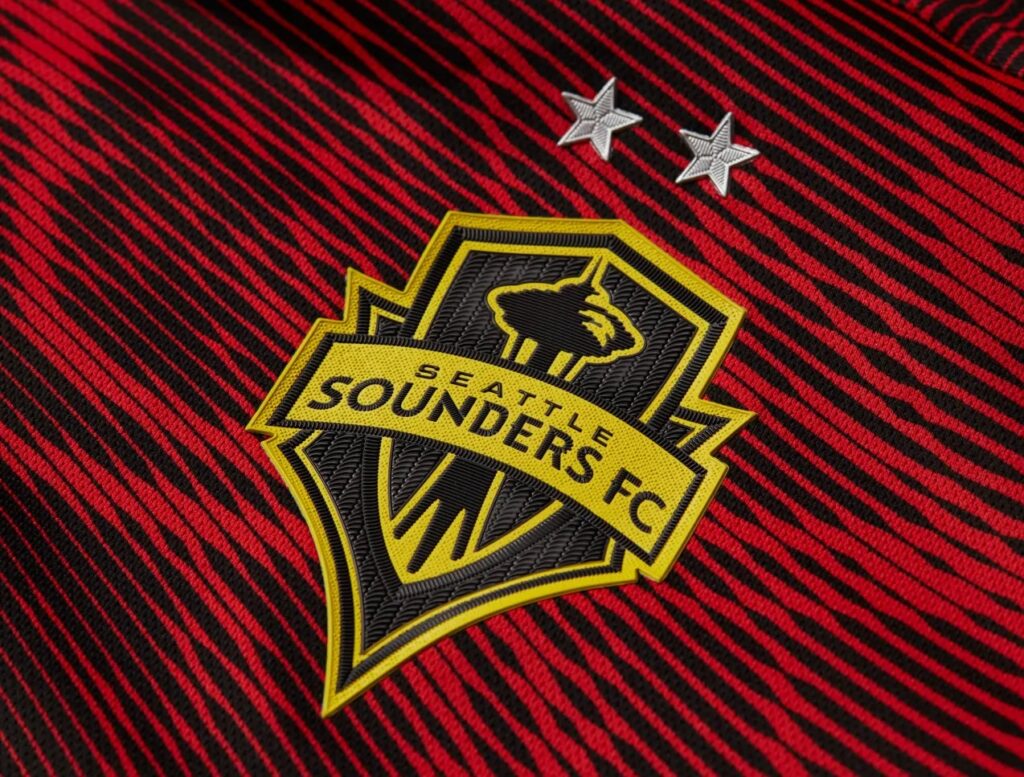
The Sounders logo is recreated in black and sunbeam yellow, with the latter, according to the club, symbolizing the center of everything. Accents in sunbeam yellow on the shoulders and hem add more visual pop to the shirt.
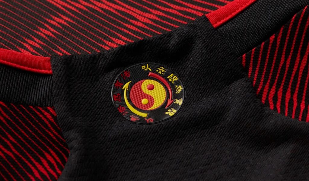
In addition, on the neck you will find Bruce Lee’s Core Symbol—representing the martial art he created, Jeet Kune Do, and his personal philosophy—encircled by one of Bruce Lee’s famous quotes in Chinese, “Using no way as way; having no limitation as limitation.” Finally, Bruce Lee’s official signature serves as a jock tag.
It is something never seen before on an MLS kit and deserves its standing as one of the most creative in MLS history.
Despite all this, there is one particular aspect about the Bruce Lee Kit that has upset many Sounders fans, such as Ashley Flannegan (@ShksprAddict on Twitter), who explains:
The Bruce Lee Kit is one of the most visually exciting kits in memory right down to the tiniest details, but I won’t be buying it.

After years of full-throated support for the LGBTIA+ community and women’s rights from the Sounders, the club has committed to a sponsorship deal with Providence, an organization that is diametrically opposed to those values so proudly touted by the club. Providence is anti-trans and anti-woman.

I am a registered nurse in Washington state, so I have even more reason to question this partnership. Providence routinely requires nurses to take patient loads far exceeding a safe ratio creating unsafe working conditions for the patients and the nurses alike.

Thankfully, some fans who have purchased the kit have found a way to remove the Providence name from the kit. For me personally, I refuse to spend any money toward a kit that is sponsored by an anti-trans, anti-choice, anti-nurse organization, no matter how badass the design may be.
It must be noted that Sounders fans aren’t the first to remove a sponsor logo from a kit, as Galaxy fans who are upset with Herbalife as their club’s sponsor have done so and replaced it with traditional Galaxy wordmarks and symbols from the original era of the club.
1 . Nashville SC – The Man in Black

From the very beginning of their existence, Nashville SC have assumed a role as curators of sound and music for their fans and the greater MLS audience.
We already saw Seattle Sounders FC honor a celebrated musician first with their Jimi Hendrix Kit. But, for 2023, Nashville has set the bar higher with their impeccable The Man in Black Kit, which pays reverence to beloved singer-songwriter Johnny Cash, whose crossover success from country to rock and gospel, earned him the rare honor of being inducted into the Country Music, Rock and Roll, and Gospel Music Halls of Fame.
During the early 1970s, Cash had built a reputation for performing dressed in entirely black suits, earning him the moniker of the “Man in Black.”
Likewise, Nashville’s new secondary kit is all black, with dark graphite and iron metallic used for the Nashville crest, Renasant Bank sponsor logo, and along the side-seam and hem.
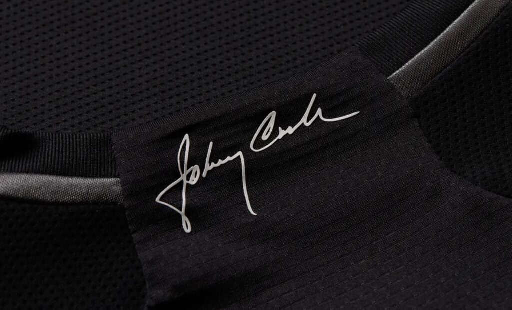
Cash’s autograph is displayed on the neck, while a monochrome version of the famous photo of him dressed to the nines taken before performing for inmates at Folsom Prison serves as the jock tag.
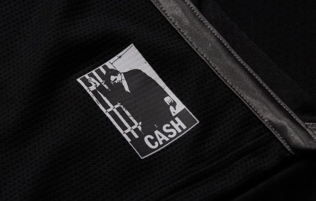
This kit is the epitome of less is more and should be lauded as deeply genuine and peerless. Furthermore, when you find out why Cash said he wore all black, the symbolism behind the Man in Black Kit takes on an even more profound meaning.
(All images are the property of Major League Soccer)
Related Post
The Fascinating True Story Behind the 2021 Community Kit and the “Amor Eterno” Video and Their Impact on Los Angeles Galaxy Lore
A SOUTHERN CALIFORNIA STORY By Edgar Zuniga This is a story about the now-legendary Los [...]
The 2024 MLS Kit Golden Age, Part 3: The Top 10
By Edgar Zuniga After going through another set of inspired kit designs with no. 19-11, [...]