The 2024 MLS Kit Golden Age
By Edgar Zuniga
MLS and Adidas did it again. Last season continued the renaissance of meaningful MLS kits that are more than a boring rag that will end up in a donation bag to Goodwill or in some collector’s storage bin. Some of the new kits for 2024 are instant legends, while some will immediately crawl into the aforementioned storage bin. Still, there are way more hits than misses and it was oh-so-difficult to pick the top 10.
But, before you start tearing apart my ranks and debating why I’m even discussing the finer details of MLS kits, I must admit that I own more than 150 kits from the four corners of the world. So, I think I know a thing or two about kits.
So, let’s begin at the bottom. In the past, I immediately knew a certain kit was awful or disappointing. This year it’s not that easy. Compared to the plain white kits we got in the past, some of these would be considered fantastic, but not this time around. If you happen to like one of these kits from the lower tier, please do not feel offended. We all have different tastes. After all, there are some people out there that think fried crickets are a proper snack. Bleh.
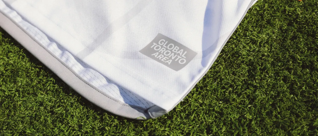
29. Toronto FC – GTA Kit
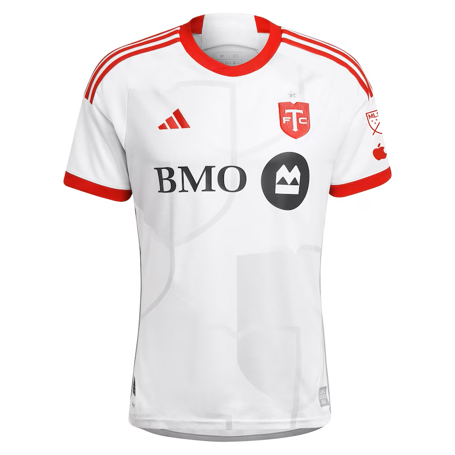
No, no, TFC didn’t strike a deal with Rockstar Toronto. GTA is an acronym for “Global Toronto Area,” which is spelled out in white on a bland, gray rectangle and serves as the jock tag for this mostly white kit. Not present is the traditional TFC badge. Instead, the club is using their minimalist, bold red secondary logo, which the club claims is a “nod to the city’s diverse culture…” among other things. Okay.

Shades and outlines of the secondary logo in very light gray can be seen across the kit, while the club’s slogan, “ALL FOR ONE” is written in gray on the neck. Overall, it’s disappointing compared to some of the other kits on this list.
TFC fan Adam Iafrate (@CratesOfFrates) wasn’t overwhelmed by the kit either.
“[It’s] not winning any awards, but the red pops off the white kit,” he said. “It’s a definite improvement over last year’s half-and-half away kit that featured zero red. It looks clean. I know some fans aren’t crazy about the shield pattern on the shirt but it’s so subtle that it doesn’t really bother me. Overall, maybe a little boring but it’s clean and it makes me wish we had a proper red home kit.”
The silver lining is that the shirt incorporates some red, which might hint at TFC going back to a full red primary kit next season, which would be huge for team nicknamed “The Reds.”
28. New York City FC – 24/7 Kit
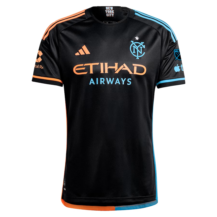
After last year’s beautiful “Interboro” primary kit, you would think the Pigeons would follow up with something just as inspired for their secondary but, instead, they unveiled the “24/7 Kit,” which is practically a plain black kit with scant blue and orange flourishes. There’s an argument to be made for a kit that’s predominantly black like Nashville’s gorgeous ’23 secondary “The Man in Black Kit,” but that one had far greater significance behind its theme.
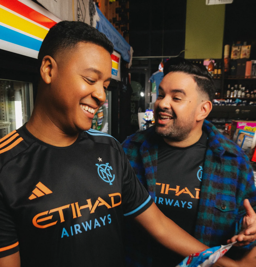
Alas, NYCFC could have done so much more than just say this a kit that embodies New York City’s night scene. If you’ve ever walked the streets of NYC at night, there are lots of bright lights and it can be loud. The 24/7 Kit comes off as subdued.
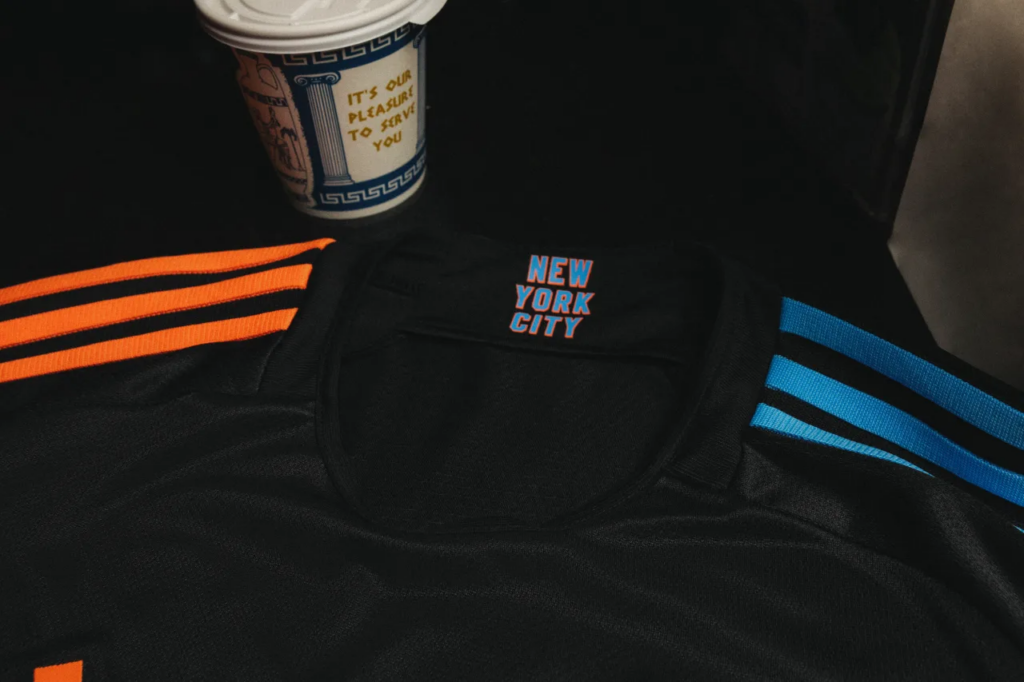
As some teams have done over the past three seasons, NYCFC used a more minimalistic version of their badge, which looks fantastic. The shirt also has “NEW YORK CITY” in blue block letters with an orange border on the inside of the neck. Orange shoulder stripes and piping along the right side and blue shoulder stripes and piping along the left add some needed color but it’s not enough.
27. FC Cincinnati – The Canvas Kit
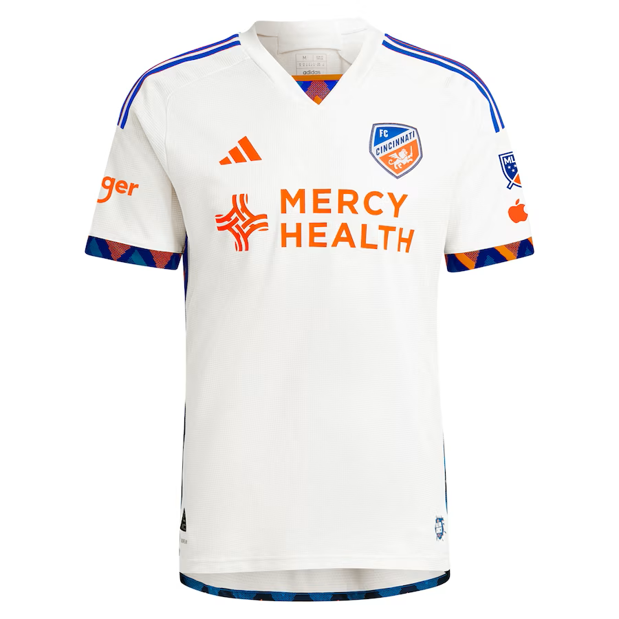
FC Cincinnati calls this white jersey “The Canvas Kit,” and is supposed to promote the city’s local artists. Well…the name is spot on. Aside from an interesting pattern composed of orange and blue triangles on the cuffs and on the piping along the sides, with a small dash on the bottom of the neck, it’s a plan white kit.
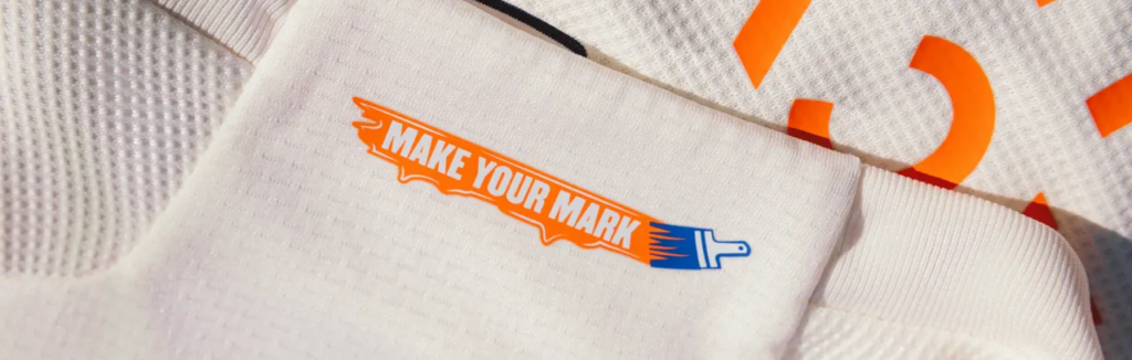
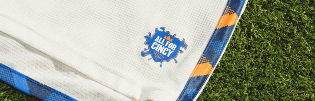
How appropriate. It’s a canvas. A plain canvas. On the back of the neck there is a graphic with a blue paintbrush leaving an orange smear that reads “MAKE YOUR MARK,” while the jock tag has a blue splotch that reads “ALL FOR CINCY” with perhaps the most noteworthy detail being a crown from the original FCC logo, from their USL days.
If you’re going to have a kit that promotes local artists, have a local artist design your kit like Colorado Rapids did last year with their “New Day” kit. For having such a cool color palate, FCC still hasn’t been able to design a notable kit in their short MLS history.
26. Inter Miami CF – 2getherness Jersey

Getting the Soccer Don’s blessing as the new flagship franchise of Major League Soccer, you would think Inter Miami would finally do something with their unique color palate. So how are they going to dress Lionel Messi and his buddies for the coming season? Well, first the good: the 2getherness Jersey is pink, which is a plus. However, stacking the Adidas logo, club’s badge, and new sponsor Royal Caribbean’s logo (which is so big it overshadows the Inter Miami badge) in the middle looks awkward at best and is downright ugly.

Only a handful of teams can pull off the center badge and this is no exception. The 2getherness Jersey is a missed opportunity to make the star-studded Miami club look their best for a global audience. Other flourishes include the return of the “FREEDOM TO DREAM” motto on the neck, while the jock tag bears a Spanish translation of the motto in tiny, barely legible script.
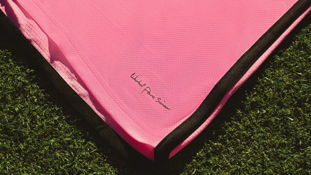
Black shoulder stripes, cuffs, and piping along the sides complete the look for a shirt that could have been much more memorable.
25. Austin FC – The Armadillo Kit
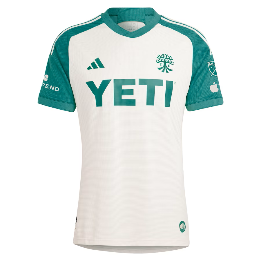
Alright. Good try, Austin. Good try. While Nashville’s ’23 “Man in Black” kit paid homage to legendary musician Johnny Cash, Austin is trying to do something similar with “The Armadillo Kit.” No, it’s not about the little armored critters. This kit is meant to pay respect to the local Austin music scene, in particular the Armadillo World Headquarters, an influential music hall and beer garden that saw its heyday from 1970 to 1980.
The kit isn’t bad. It’s just a bit too drab for what it is attempting to do, and the light shade of green used for the body of the kit is very reminiscent of Colorado’s 2021 secondary “Class 5” kit. At least The Armadillo Kit isn’t entirely plain, with green shoulders and the large YETI sponsor logo giving it much needed color.

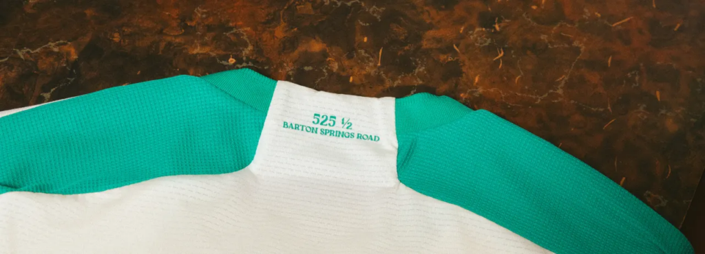
Other details include “525 ½ Barton Springs Road,” the old address of the Armadillo WHQ, scribbled on the neck and a drawing of an actual armadillo as the jock tag.
24. FC Dallas – Afterburner Kit
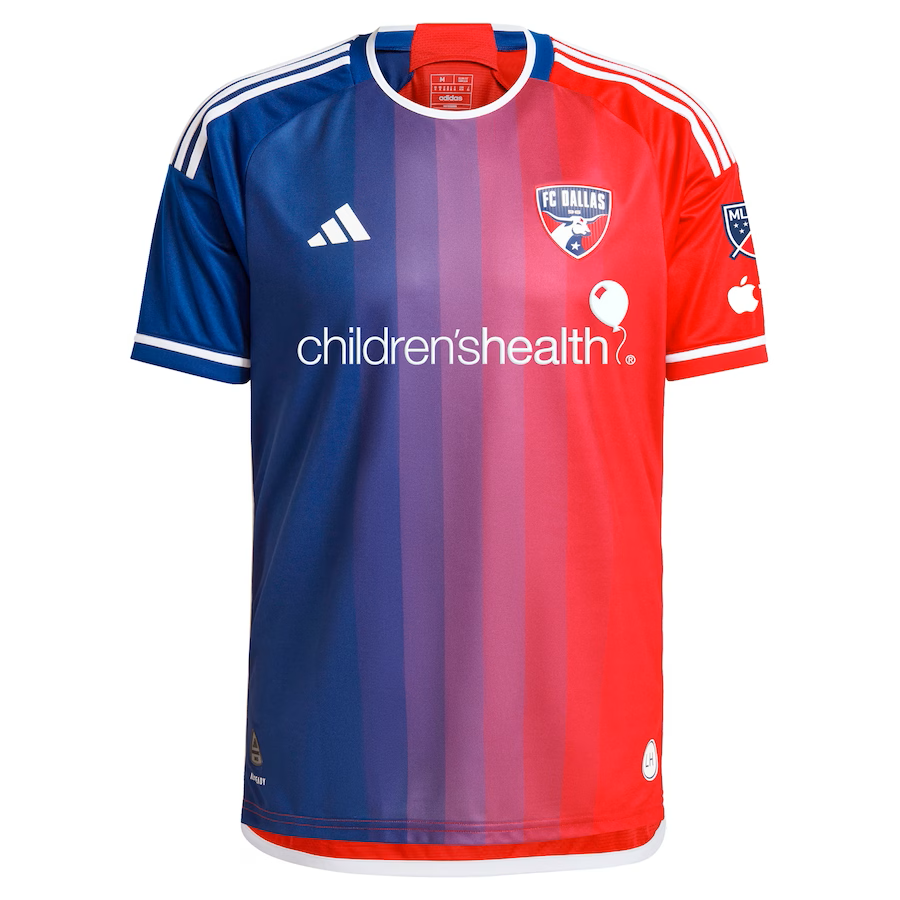
Hoops! What’s so difficult about hoops? Once again, FC Dallas has inexplicably forgotten about the identity they established many years ago with their tasty red and white hoops kits. Instead, we get a kit that is having an identity crisis because it doesn’t know if it’s blue or red.
To be fair, it sounds worse than it looks, with the gradient transition from blue to red yielding varying vertical shades of purple running down the middle of the kit. Sadly, the back of the kit lacks the same character as it is predominantly red. Brave attempt, nonetheless.
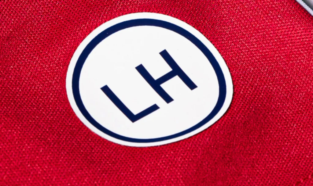
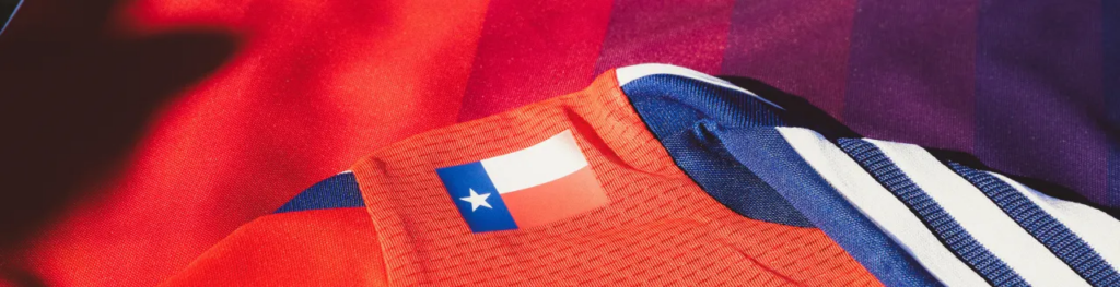
Other details include the Texas state flag on the neck and the initials of the legendary Lamar Hunt used as the jock tag. Maybe one day, FCD will go back to the hoops.
23. Houston Dynamo FC – Still Holdin’ Jersey
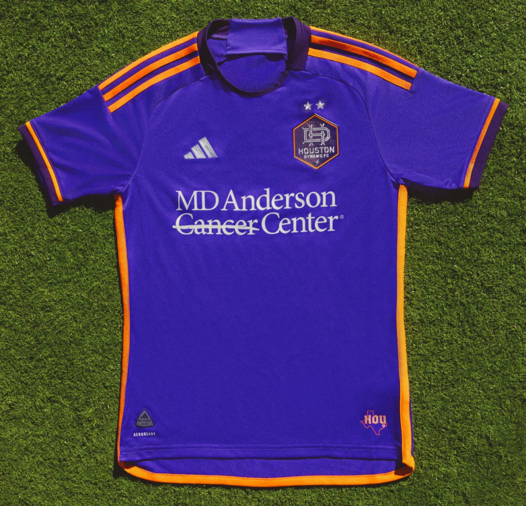
No, this is not Houston’s tribute to the City of Orlando. Apparently, purple is the city’s unofficial secondary color. That obscure bit of Houston lore is part of the inspiration for the new “Still Holdin’” jersey. The other half leans into H-Town hip-hop culture from the ‘90s and early 2000s.
Someone in Houston still has a sweet spot for some sizzurp, apparently, which has fallen out of favor due to its detrimental health effects. Nevertheless, if you’ve been pining for years and holdin’ it down for a shirt to celebrate purple drank, here you go.
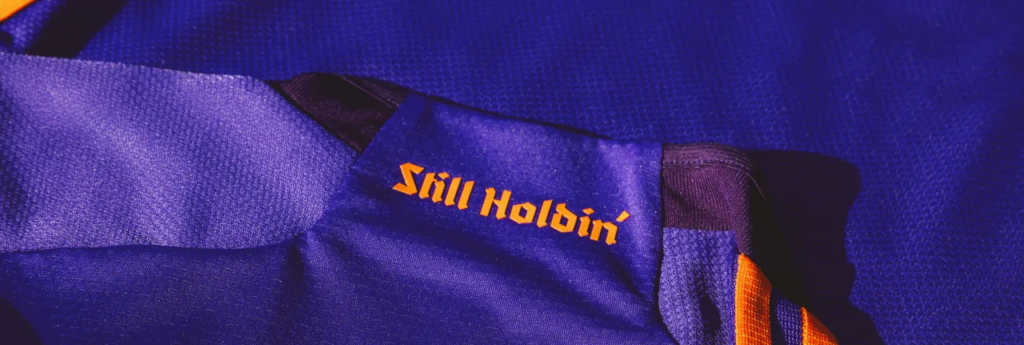
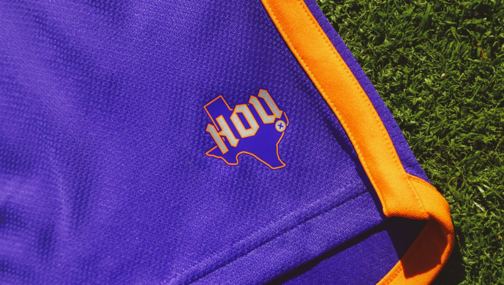
The shirt itself isn’t so bad. The bits of orange on the kit, found on the shoulder stripes, cuffs, and piping along the sides, pop, as does a plum-colored version of the Dynamo logo with an orange border, while a darker shade of purple is used around the neck and also on the cuffs. The “Still Holdin’” moniker is found in orange calligraphy on the neck, while an orange outline of the state of Texas with “HOU” (also in calligraphy) with an x to mark the geographical location of the city serves as the jock tag.
It will be interesting to see how popular the “Sill Holdin’” kit will be with Houston fans, but Finn (@DynaPod), host of the Houston Dyna Pod, is not a fan.
“They should have named it ‘syzzurp’ or ‘lean,” he quipped. “Take advantage of chopped and screwed down here Houston. Definitely hip-hop inspired. I don’t know, man. I ain’t wearing no purple jersey.”
22. San Jose Earthquakes – The 50 Kit
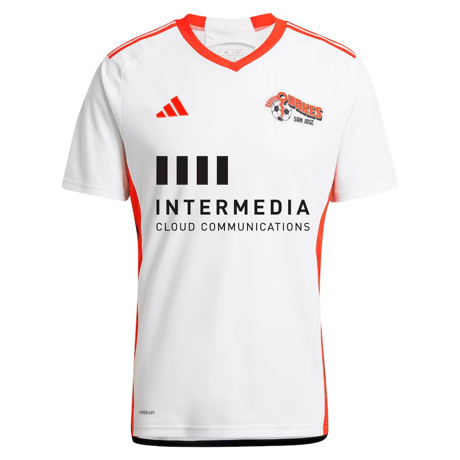
Nostalgia goes a long way. In any other year, San Jose’s new kit would be brushed aside as just another boring white kit. But, in celebration of the club’s 50th anniversary, the club has unveiled a snazzy new secondary dubbed “The 50 Kit.” While the MLS Earthquakes got their start in ’96 as the San Jose Clash, the Earthquakes brand has been around since the NASL era.
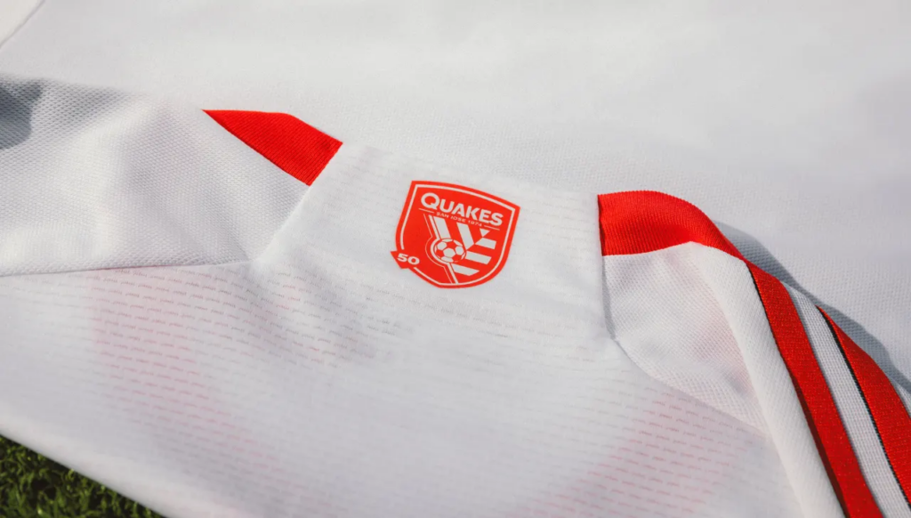
Instead of the usual peculiar Quakes logo, The 50 Kit uses the original quaint Quakes logo, which grants this shirt instant appeal. While the Quakes have adopted black and blue as their colors, they instead fully embrace their NASL roots with this kit. There are flourishes of red on the shoulder stripes, around the neck, and cuffs, while along the sides, the kit has wide red bands with different logos and wordmarks from the club’s NASL days, bisected by black piping.

The current Quakes logo, but in red with a small 50 tag, can still be found on the back of the neck while their original NASL logo, with “SINCE ‘74” underneath, serves as the jock tag. It is a clean, sharp shirt and will be a huge hit with San Jose fans. This kit would be ranked higher if not for the baffling decision to use white instead of making the bold decision to go with red (like their original kits), which would have The 50 Kit instantly legendary.
21. Atlanta United FC – The Resurgens Kit
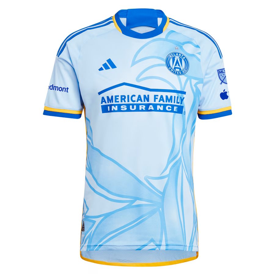
Give Atlanta United FC credit for trying different themes that embrace their region with their secondary and tertiary kits. This time around, Atlanta unveiled “The Resurgens Kit,” which unless you’re from Atlanta will make you wonder why they misspelled “resurgence.” However, the kit is inspired by the flag of the City of Atlanta, which incorporates the City seal, which depicts a phoenix rising from the flames with “RESURGENS” (Latin for “rising”) atop the seal.

When sports teams incorporate colors of their local flags into their kit design, the results can be hit (LA Galaxy’s ’23 “LA Kit”) or miss (Columbus Crew’s ’16 “For Columbus”). Atlanta’s version is light blue with a closeup outline of a phoenix covering most of the front while the City seal from the flag can be found on the back of the neck. A darker shade of blue is used on the shoulder stripes, while blue and yellow are found around the neck and cuffs, to go with yellow piping along the sides.
Tyler Pilgrim (@ATLPilgrim) of the Scarves and Spikes podcast (@ScarvesNSpikes) praised The Resurgens Kit.
“I love the kit,” he admitted. “It’s a good mix of lighter colors with just enough contrast to bring the phoenix to the forefront, while representing the overarching symbol of Atlanta’s rise from ashes. It’s clean but has a ton of symbolism behind its design.”
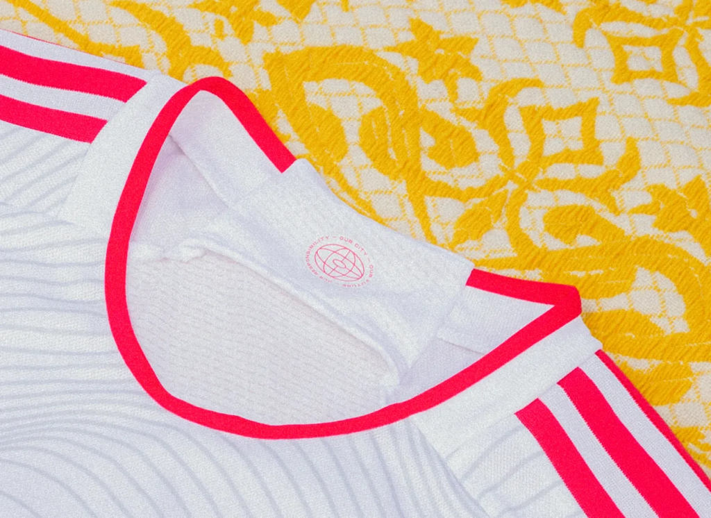
20. St. Louis CITY SC – The Confluence Kit
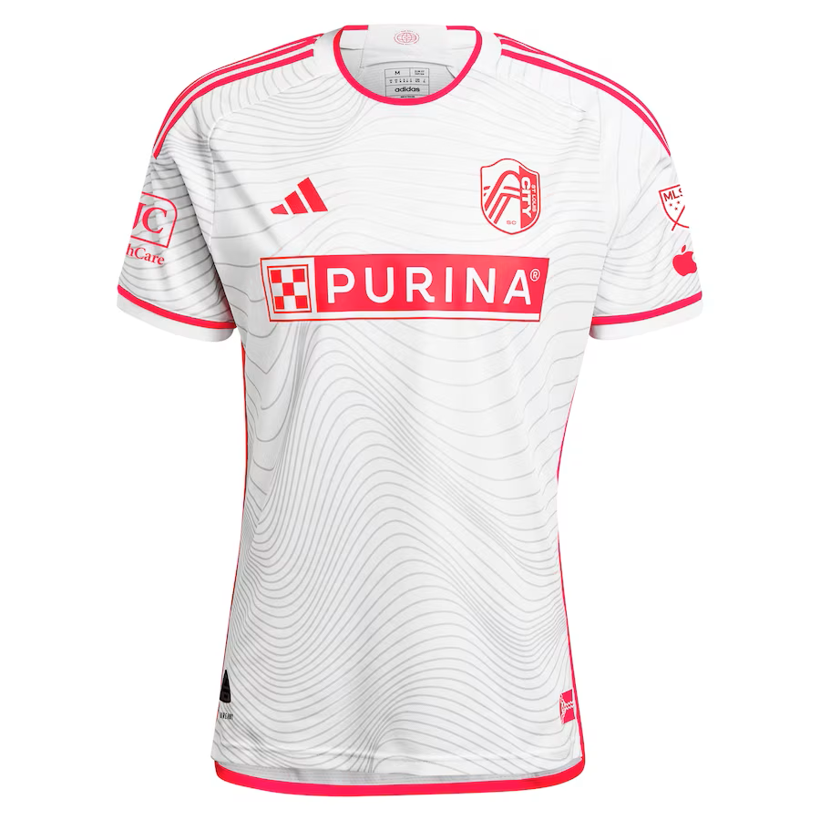
After last year’s bland “The Spirit” secondary kit, St. Louis CITY SC used their mulligan to favorable effect and came back with “The Confluence Kit.”
Matt Baker (@MattBakerSTL), co-host of Flyover Footy (@FlyoverFooty) gave the new kit a glowing review.
“[T]he Confluence Kit, is a big step up from last year in both meaning to the St. Louis region and overall design,” he explained. “The wavy lines throughout are very noticeable in person and are a tie to the confluence of the Missouri and Mississippi Rivers that meet in St. Louis. They add a textured quality to the slick looking single tone CITY Red that incorporates all club and sponsor branding, making it a really seamless looking kit that complements our flashy home kit well.”
(Photo courtesy of Matt Baker)
The decision to use an alternate version of the STL logo in white and CITY Red works to great effect. Meanwhile, the CITY red is also used on the shoulder stripes, around the neck, cuffs, and on the piping along the sides. A graphic of several intersecting ovals with the phrases “Our City – Our Future – Our Responsibility” is found on the inside of the neck while the City’s flag in CITY Red is used for the jock tag.
What do you think about this first group? Are there any kits that you think deserve to be higher on the list? Next up, 20-11.
(All images are the property of Major League Soccer, unless otherwise specified.)
Related Post
The 2023 MLS Kit Renaissance, Part 2
By Edgar Zuniga After reviewing some less desirable designs ranked no. 30 – 21, we [...]