The 2024 MLS Kit Golden Age, Part 3: The Top 10
By Edgar Zuniga
After going through another set of inspired kit designs with no. 19-11, we finally get to the very best MLS kits of 2024 and they are all fantastic but only one was immediately my no. 1 and you’ll see why. So let’s dive in!
10. Orlando City SC – Legacy Kit
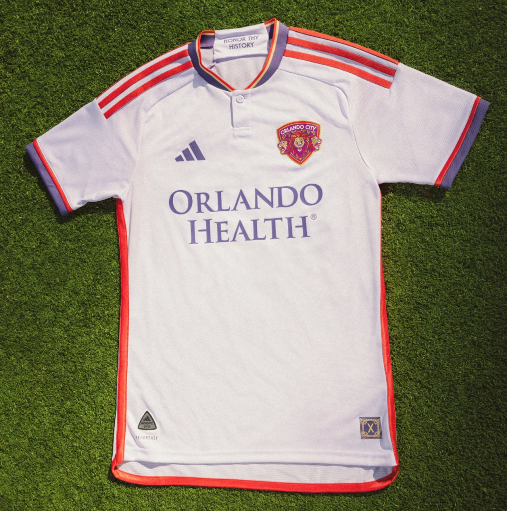
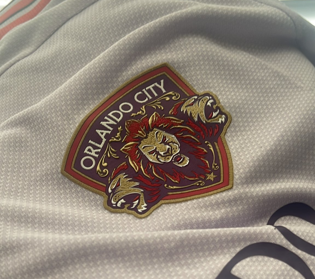
Anniversaries seem to be a recurring theme with MLS kits in 2024 and when rumor got out that Orlando City was going to go beyond celebrating 10 years of MLS existence, excitement began to grow across central Florida. Although it wasn’t Orlando’s famous Red Kit from their USL Pro days, the famed “Lions” badge from that era got a modern makeover and now adorns the new “Legacy Kit.”
(Photo courtesy of Mike Spillane)
Suffice it to say that this jersey received universal acclaim and is being regarded as an instant classic by Orlando fans. Mike Spillane (@mikeaspillane) from the Orlando Lions Den Podcast (@orlandolionsden) explained why it means so much to Orlando City fans.
“So, as an anniversary kit, it goes back to our roots, and what some people don’t know is, at first, we wore red,” he said. “Lavender primary color and red accents with a throwback to the USL era crest, only it is redesigned and modernized in a very tasteful way. Love how they did it. Love that for the launch event they brought back players from all eras of us, in USL and MLS, to model old jerseys and the new jersey, as well.
“I think the most shocking part for us was seeing the three lions again,” he added.

The kit has a light lavender base with red stripes on the shoulders and on the piping along the sides. A mix of red and purple is seen on the cuffs while the kit employs a henley collar in purple, gold, and red.
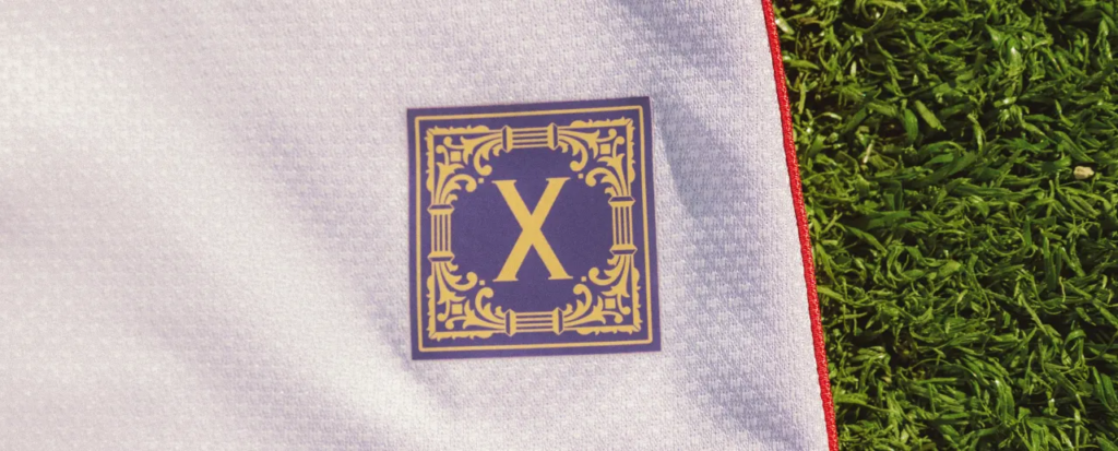
The phrase “HONOR THY HISTORY” is found on the inside of the neck while an ornamental Roman numeral 10 is used for the jock tag.
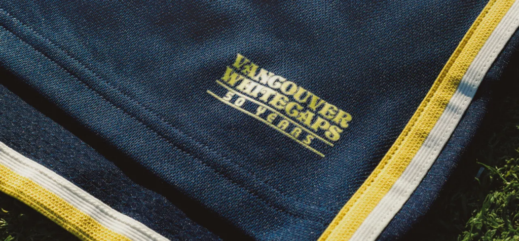
9. Vancouver Whitecaps FC – The 50 Jersey

This is what happens when a minimalist approach absolutely nails the assignment. Then again, Vancouver Whitecaps have always had beautiful kits and you can add another one to the list. Vancouver is another of the former NASL teams from ’74 that is celebrating their 50th anniversary so the brain trust at the Whitecaps spent an entire morning with several gallons of Tim Horton’s and mound of Timbits to finally settle on naming it “The 50 Jersey.” Womp. Womp.
Nevertheless, the shirt is so elegant, so vintage classy that the name is an afterthought.
Nathan Durec (@ndurec) co-host of the Terminal City FC Podcast (@TerminalCityFC) explains the idea behind the design.
“It’s the 50-year anniversary kit, celebrating Whitecaps’ history since the club’s founding in 1974,” he explained. “The badge is a nod to that history. It’s the original badge from the 1974 NASL days, except in gold rather than the original red. Gold is being used as 50 years is traditionally the ‘Golden Anniversary.’ Personally, I love the kit. It’s a simple re-imagining with a classic look.”

The 50 Jersey is navy blue with gold shoulder stripes and gold and white piping along the sides with a bit of gold and white beneath the front of the neck. Meanwhile, the contemporary ‘Caps logo is found on the back of the neck and a wordmark with the club’s name and “50 YEARS” beneath serve as the jock tag.
The idea to have the adidas and sponsor logos and all other additions in the same gold as the Vancouver badge further cements the appeal of this excellent kit.
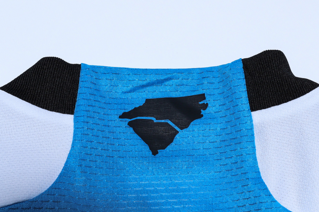
8. Charlotte FC – The Carolina Kit: Explore

If at first glance you saw this kit and thought it was just different stripes of shades of blue, please take a closer look at one of the more aesthetically pleasing kits in MLS history. More than just a blue color swatch, the “Carolina Kit: Explore” showcases the natural beauty of the Carolinas, from the mountains to the sea.
Each shade of blue is representative of various topographical features and elevation changes across the Carolinas, from the very top of the Appalachian Mountains in the west to the central Piedmont region and the Atlantic coastal plain.
Lee from CLTFC Fan TV (@cltfcfantv) didn’t mince words, exclaiming, “I love the new kit. The price, not so much, but I understand it’s an MLS thing, not so much a Charlotte FC thing. The way it incorporates all of the Carolinas is on point. I rate it a solid 9. There is always room for improvement!”
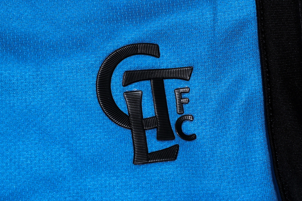
The Carolina Kit: Explore is a thing of beauty, with a white base and the topographical design across the front. Black shoulder stripes, cuffs and piping along the sides provide a sharp contrast to frame the design. The idea of having the back of the shirt in Carolina blue was brilliant. A map of the Carolinas is found on the back of the neck, while an embossed secondary CLTFC logo serves as the jock tag.
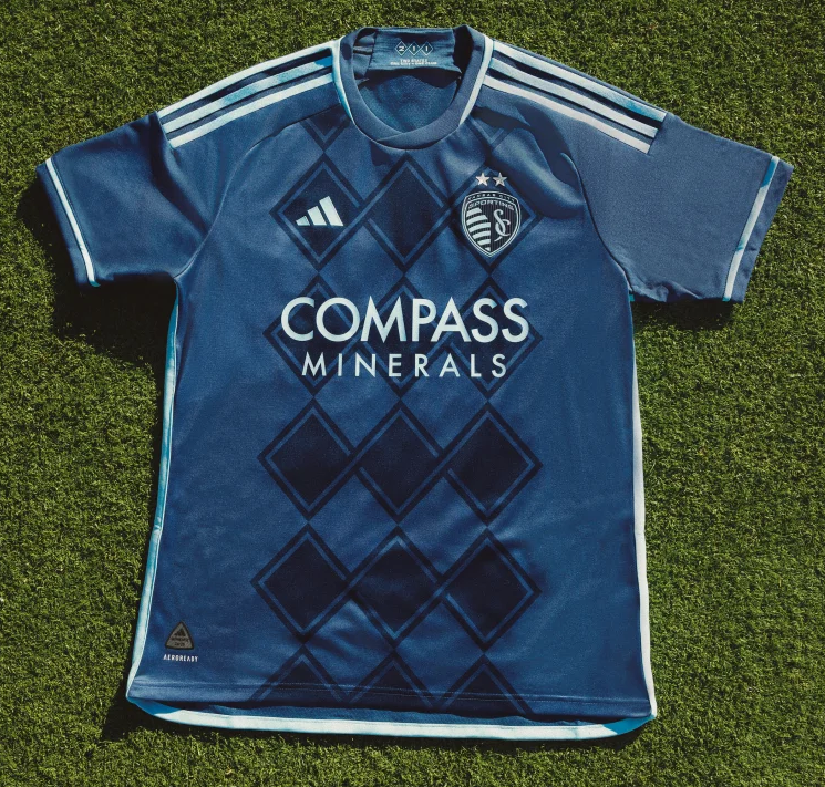
7. Sporting Kansas City – Diamonds Our Forever
Whether it was as the Kansas City Wiz, Wizards, or as Sporting Kansas City, this franchise has had quite an eventful and colorful kit history. From the Wizard of Oz-inspired rainbow kits of their early years to the relatively bland 2000s to the polished and posh look after their major re-brand in 2011, SKC’s kits have become the stuff of MLS legend.
However, one design that was initially used for a third kit from 2013 was so well-received it has remained an all-time favorite amongst SKC fans. We’re obviously referring to the argyle diamond pattern which hasn’t been seen since 2016 but which makes a triumphant return for 2024. Of course, it iconic as ever.
With a rich shade of dark blue as the base, embossed argyle diamonds adorn the front of the “Diamonds Our Forever.” It’s simple but effective. Lighter SKC blue is used on the shoulder stripes, cuffs, around the neck, and on the piping along the sides, and is also implemented for the Adidas and sponsor logos and the SKC badge.
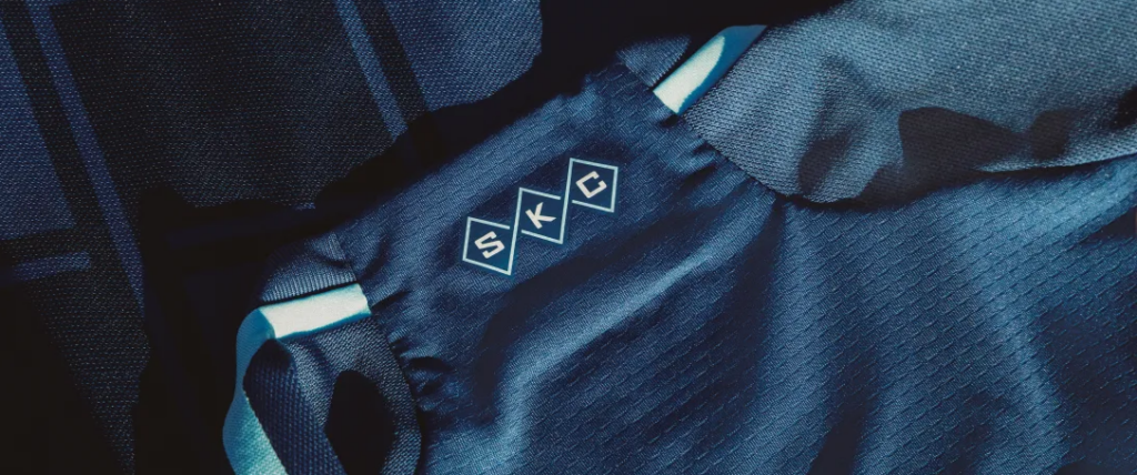
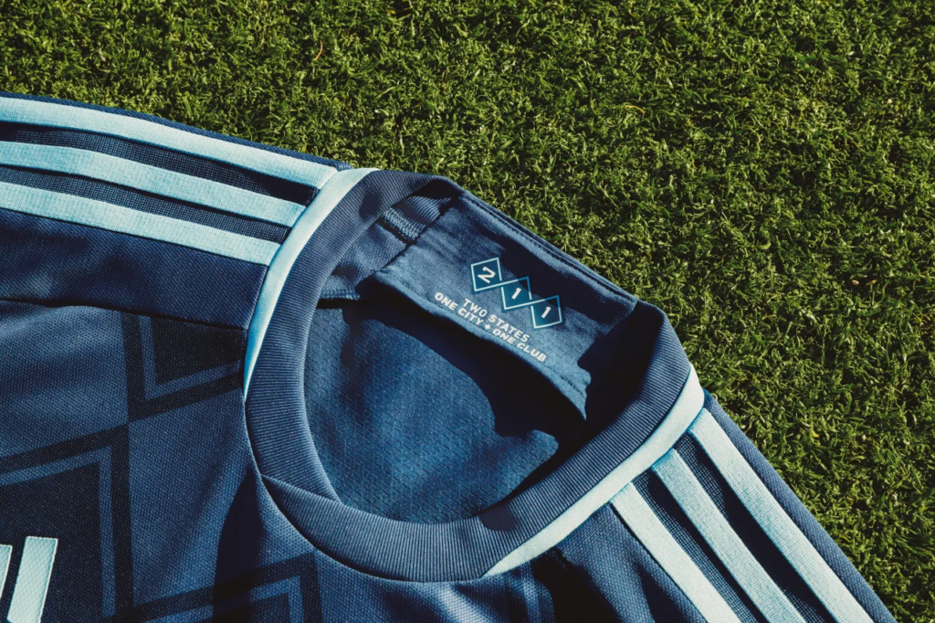
The argyle diamonds are also found on the inside of the neck with the numbers 2, 1, 1 and the phrase, “Two states. One City. One club” pertaining to Kansas City being located on the border between Kansas and Missouri. Meanwhile, on the back of the neck, the argyle diamonds contain the SKC acronym.
6. Real Salt Lake – Peak Utah

Well, this is quite a departure from any kits Real Salt Lake has ever worn. There is so much going on here. First of all, the use of vertical claret red and cobalt blue stripes is fascinating for a club whose name was inspired by La Liga’s Real Madrid, but which will hit the pitch looking like FC Barcelona. There’s also the not discrete-at-all use of the exact same mountain design from the 2010 Slovenia kit by Nike.
Shrug

(Photo courtesy of Alex Napoles)
But, despite these quirks, this is a truly unique kit, particularly since RSL has never incorporated vertical stripes into their kit designs. Salt Lake City is nestled along the Wasatch Range of the greater Rocky Mountains so, by all means, it makes sense to use the mountain motif, which is why the kit has been dubbed “Peak Utah.”

Alex Napoles (@NapolesAlex) of the RSL Show on KSL (@rslshow) is a huge fan of the new kit, giving it an 8 out of 10, proclaiming, “[It is] easily the most creative kit that RSL has released. At times the kit seems busy because of the amount of cobalt blue and designs, but it’s the first kit to incorporate the mountains and it feels like home.”
Home.
A primary kit that reminds you of home is always a significant positive and is something you will proudly wear anywhere you go.

The rest of the kit incorporates gold on the shoulder stripes and on the piping along the sides. The same shade of gold is also used for the Adidas and sponsor logos and for a representation of club mascot Leo the Lion wearing a kingly crown found on the neck. A honeycomb pattern in the shape of Utah (the Beehive State) with the club’s year of establishment serves as the jock tag.
5. Philadelphia Union – XV Kit
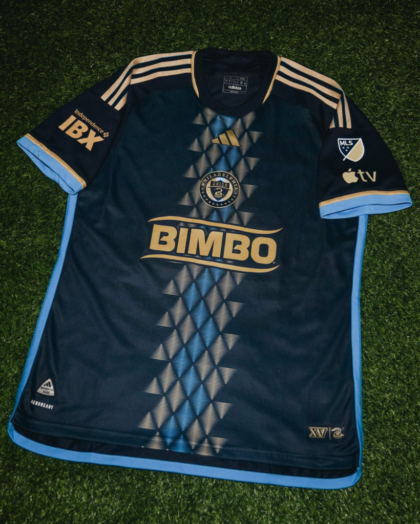
As I previously stated, only a handful of teams can pull off the center badge on a kit and for their first eight seasons, Philadelphia Union did just that. Saddled with a seemingly silly sponsor name (Bimbo is actually a food company headquartered in Mexico City), having the club badge just over it takes some of the attention away from what is deemed a pejorative slang term in the US.
But credit to Bimbo for doing their best to fit the theme of Philly’s sleek new “XV Kit,” which sees the return of the center badge as the club celebrates its 15th anniversary. (Maybe we should gather all these teams celebrating their anniversaries and sing them “Happy Birthday.”)
Philly is known for their coiled serpent mascot, which is found on their badge, and seems to be an inspiration for a jagged, stylized serpent pattern that serves as a stripe running down the middle of the XV Kit. The gold stripe is bisected by a light blue winding stripe that evokes a sense of movement and dread from a serpent in motion.
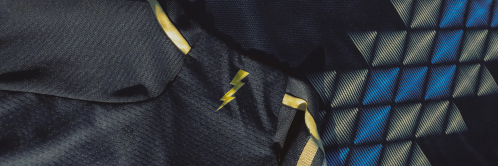
The serpent pattern isn’t overused, which maintains the focus on the center of the shirt. Gold shoulder stripes and some gold on the neck and a mix of gold and light blue on the cuffs, with light blue piping along the sides, complete the look.
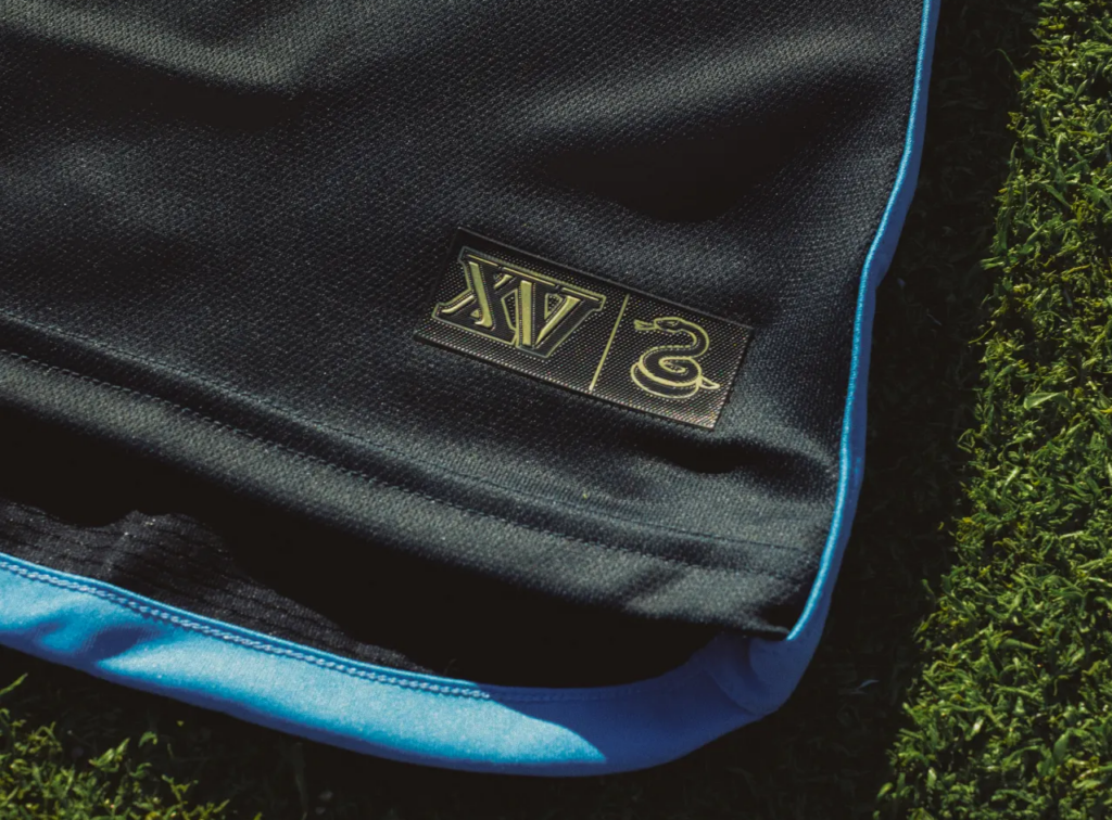
Other details include a gold lightning bolt on the back of the neck and a jock tag composed of “XV” and the coiled serpent logo.
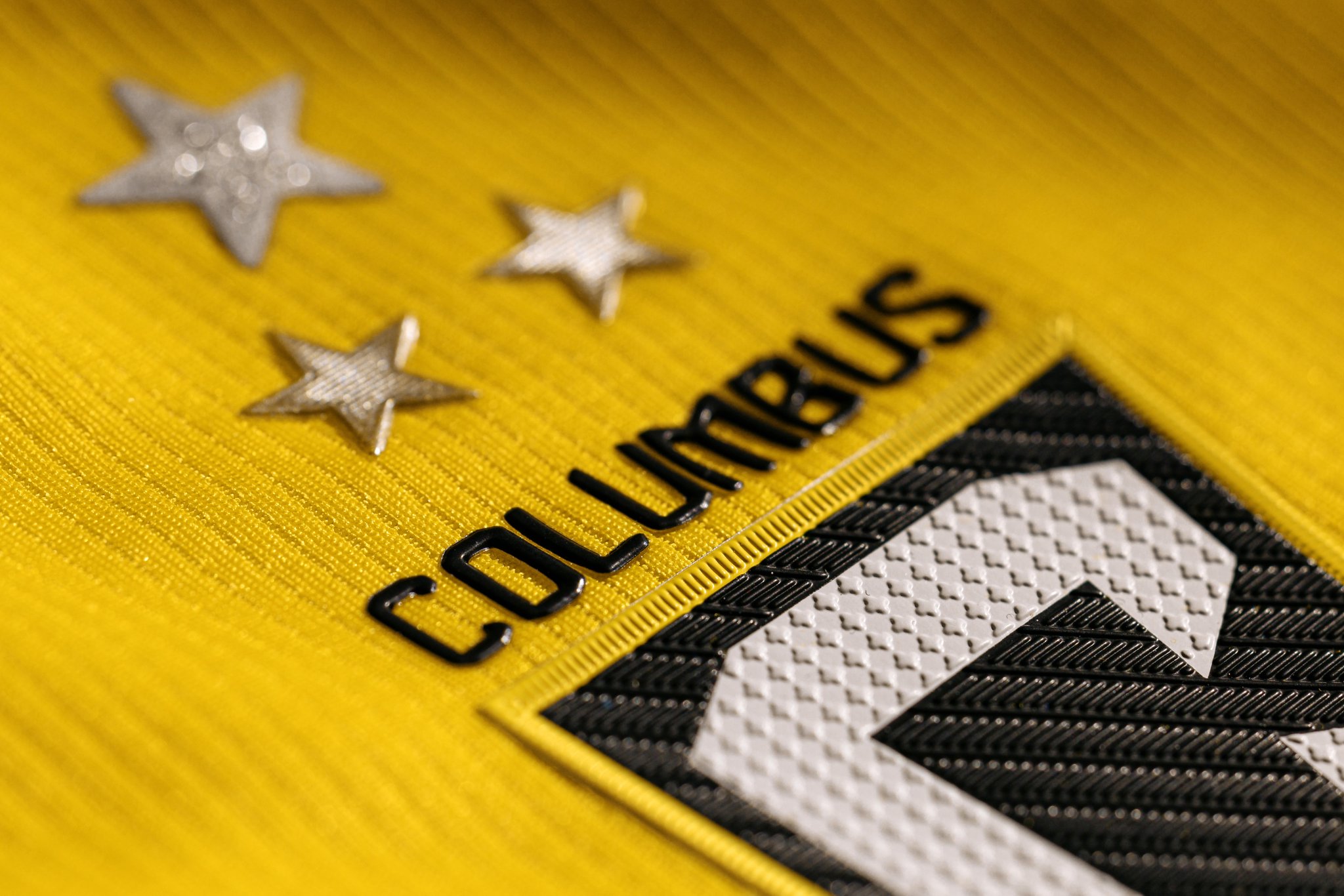
4. Columbus Crew SC – The Home Kit
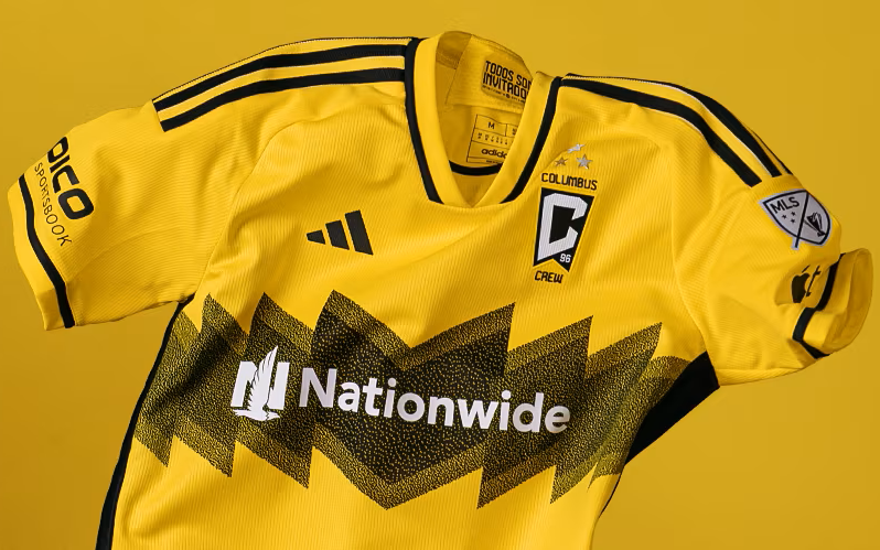
Good grief. Get it out of your system. Yes, the new Columbus Crew kit looks oddly familiar to Charlie Brown’s favorite zigzag patterned shirt. However, unlike everyone’s favorite lovable loser, Columbus Crew is celebrating yet another MLS Cup victory, adding a third star above the badge of their jersey, dubbed “The Home Kit,” and will have the distinction of wearing an MLS Cup scudetto on their left shoulder.
All jokes aside, when you take a deeper look at the Charlie Brown archetype, he represents the average person, who must constantly find the courage to overcome great odds and significant obstacles. Crew fans are familiar with this, having to endure a multitude of doubt and grief when they fought to keep their club in Columbus, and who have celebrated two MLS Cups (2020 and 2023) and a Campeones Cup (2021) over the last five years.
Ty Fisher (@FisherTyler__) co-host of The Wise Men Say Podcast (@WiseMenPod) shared his thoughts on The Home Kit and offered more insight.
“The kit itself is pretty nice,” he remarked. “Black shorts were the best way to go, but I can see all-yellow making an appearance or two this year, also. The design is inspired by the angular architecture of Lower.com Field and the surrounding buildings of Astor Park. Expect lots of goals coming from the team wearing the kit, but many missed extra points.”
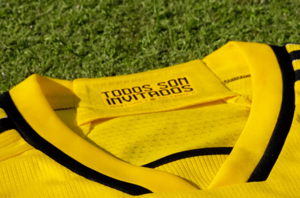
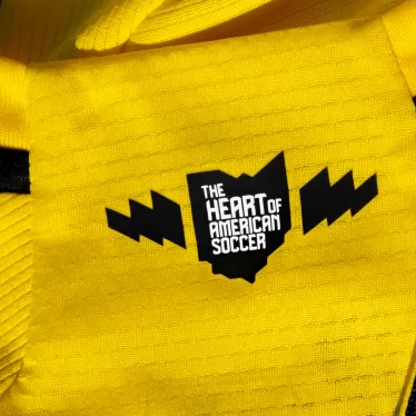
The shirt has a gold base with a distressed black zig zag pattern across the middle. Black shoulder stripes, a thin band around the cuffs and neck, and on the piping along the sides, frame what is a distinctive and ultimately sharp-looking kit. A silhouette of the state of Ohio with the phrase “The heart of American soccer” flanked by zigzags is found on the back of the neck, while the inside has the inscription “Todos son invitados,” which is Spanish for “All are welcome,” above the geographic coordinates of Lower.com Field.
Unless the other team has someone named Lucy on the roster, Columbus Crew should remain contenders this season as they look to defend their crown.
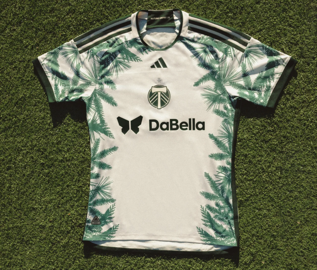
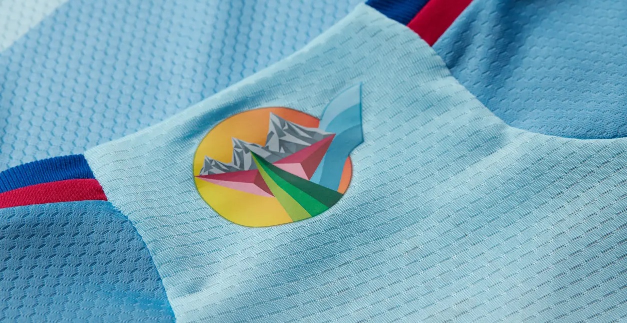
3. Portland Timbers – Nature Unites
“And into the forest I go, to lose my mind and find my soul.”
John Muir
If you’ve ever been to Portland or are familiar at all with the Pacific Northwest, you understand the proximity to and connection that natives of the region have with vast and magisterial forests. This is ever-present with Portland Timbers. It’s in their name, the character of their extraordinary home, Providence Park, and now—more than ever—in their kits.
The new “Nature Unites” kit isn’t just an ode to the woods of the PNW. The club hopes to promote recycling, composting, and green energy in an attempt to protect natural spaces. No MLS club has ever had a kit like this. With a light shade of green as the base, the kit is adorned with pine bristles serving as a frame, giving the impression of being deep in the woods and looking up at the forest canopy.
It’s the first time the Timbers have used a center badge and they have done it in seamless fashion, with the Adidas logo, a monochromatic Timbers badge and their sponsor logo all fitting in with the theme and giving the kit the right amount of balance. Update: As of Wed., Feb. 28, the club terminated their sponsorship deal with DaBella, so Portland Timbers chose to remove the sponsor logo and offered fans the opportunity to exchange their old kits for the new sponsor-less ones.
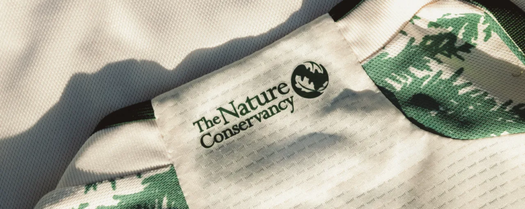
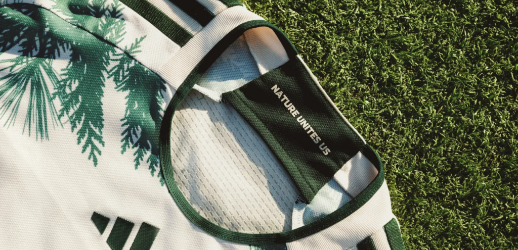
Green is also found on the shoulder stripes and along the neckline, cuffs, and on the piping along the sides. The logo of The Nature Conservancy, a global environmental organization, is found on the back of the neck, while the inside bears the name of the kit.
Legendary naturalist John Muir might not have been a sports fan, but his quote can easily be applied to anyone wearing the Nature Unites Us kit as they enter the cacophony of the Timbers Army. This, like the next two kits are instant timeless classics.
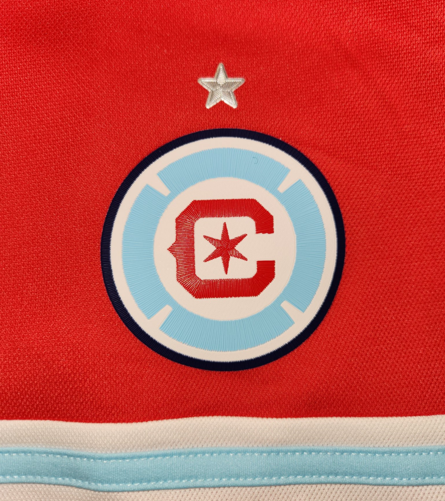
2. Chicago Fire FC – Return to Red
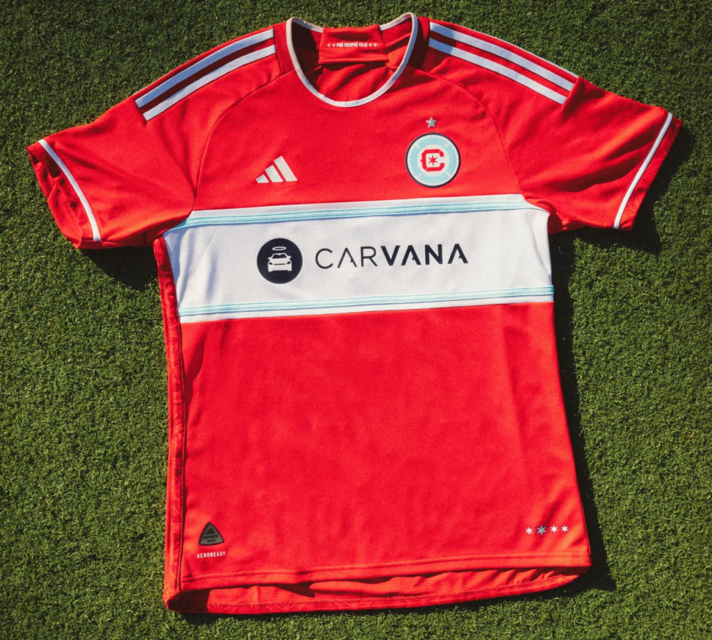
I have withheld describing any of the other MLS kits on this list with a certain ardent expression because only one kit deserves it. The “Return to Red” kit is absolute fire.
For the first time since 2019, and after a failed and reviled re-brand of the club’s iconic Florian cross logo and forsaking of the red uniforms, the stars have finally aligned, and Chicago Fire are once again dressed in red. While the re-redesigned logo still falls short of the legendary original, it looks much more at home on the new Return to Red kit. Perhaps because that is where it always belonged.
(Photo courtesy of Nick Glass)
Nick Glass, who covers Chicago Fire through Glass House Soccer (@glasshousesoccr), was ecstatic with the beleaguered club’s “Return to Red,” which is more than just a name for the new kit but the mantra for the club in 2024.
“There’s only one word to describe Chicago’s new kit: FIRE. In their Return To Red, the Chicago Fire get back to the color of trophy-winning seasons and all-star players,” he explained. “The kit is clean in its overall design but especially in its lines—including the light blue of the Chicago city flag. As so many fans have said: THIS is a Chicago Fire kit.”
While some Fire fans might say it’s not the best kit in club history, the fact that this new kit goes so hard in red is reason enough for its lofty ranking. The red kit is bisected by a wide white stripe that has thin light blue stripes and is an obvious recreation of the city flag, while white shoulder stripes and a strip of white on the cuffs offer a dash of equilibrium.
(Photo courtesy of Nick Glass)
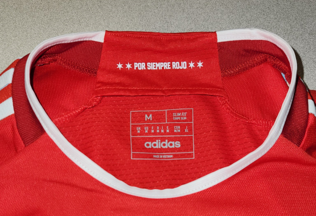
The Spanish inscription “POR SIEMPRE ROJO,” which translates to “Forever Red” is found on the inside of the neck and is flanked by stars from the city flag, while the stars themselves serve as a jock tag, with one of them larger than others to commemorate the club’s lone 1998 MLS Cup victory.

Other less noticeable details include embossed stars on the red piping along the sides and lower hem. It’s more than a kit; it’s a flag, and quite possibly a symbol of a return to prominence for a franchise that somehow lost its spark.
1. Minnesota United FC – Starry Night

You know that feeling you get when you come across something for the first time and you know—you know—that it is something special, without peer, and superlative in every aspect? That’s what happens when you lay eyes on Minnesota United’s new “Starry Night” kit, which took last year’s idea of the “Northern Lights Kit” to a whole new level.
Practically, to the stars.
Last year, I noted that USL W League club Minnesota Aurora FC’s ’22 inaugural home kit was a better representation of the Northern Lights motif. Did someone take that as a challenge to design something just as stunning this year for Minnesota United, because the Starry Night kit is breathtaking and unlike anything ever seen in MLS.
The Loonacy Podcast (@LoonacyP), who cover all things Minnesota United, gave it a glowing review: “It pairs really well with the Northern Lights kit from last year. No wings or sashes for some of the fans of our older kits, but we’re not complaining. Adidas outdid themselves on this one.”
If you’ve never gazed at the majesty of a starry night, get out of the city, head out to big sky country on a clear night, and bask in the glory of the cosmos. Or you can just buy a new Starry Night kit and marvel at its grandeur. There’s no other way to describe it. Does an MLS team really have to wear something that reminds us of our place in the vastness of the universe?
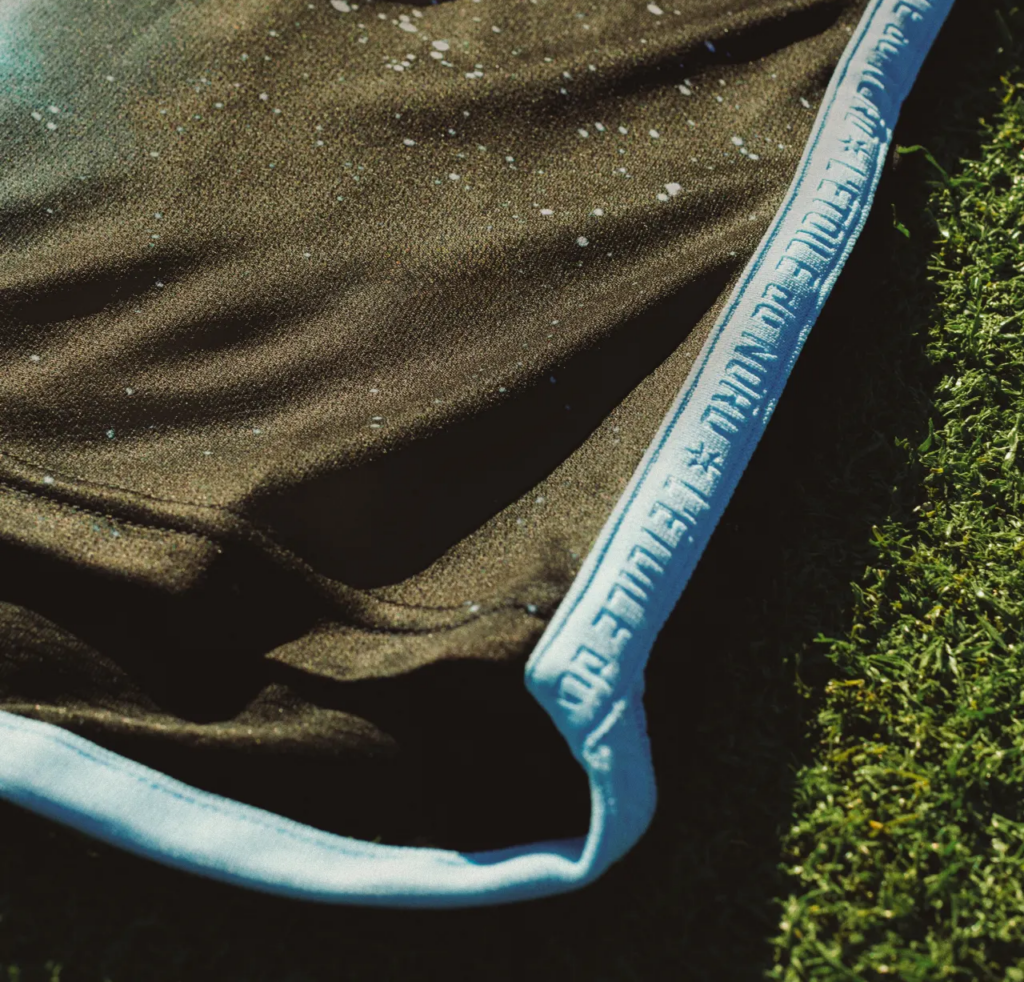
The Starry Night kit also has sky blue shoulder stripes, with a bit around the neck, and on the piping along the sides and into the hem of the back of the shirt. The club’s famed Loon symbol is found on the inside of the neck, while the French phrase “L’etoille du Nord,” which translates to “The North Star” is embossed in the piping along with the north star from the club’s logo.
So, there you have it. MLS has stepped up its kit game in a major way and we can only imagine what next year will bring. However, some MLS clubs won’t have to wait that long, as at least five MLS teams, including Inter Miami, LAFC, LA Galaxy, Portland Timbers, and SKC will be getting Third Kits later this year. Yes, those will get reviewed and ranked, as well.
For now, are there some kits that you think belong higher on this list? Are there some that you think do not belong in the Top 10? If you disagree, let me know on Twitter/X and keep an eye out for the 2024 MLS Kit Tournament, which allows you, the fans, to determine which kit is your favorite.
A huge thanks to all the MLS podcasters, creatives, and journalists that contributed to this article. Please share this article on your social media platforms so we can get more voices involved in the conversation!
(All images are the property of Major League Soccer, unless otherwise specified.)
Related Post
The 2023 MLS Kit Renaissance, Part 2
By Edgar Zuniga After reviewing some less desirable designs ranked no. 30 – 21, we [...]