The 2023 MLS Kit Renaissance
By Edgar Zuniga
After several years of Adidas giving us banger after banger of plain white kits with intricate descriptions of how polar bears having snowball fights with polar mice in the middle of a blizzard were vital representations of civic culture, for 2023, the Major League Soccer (MLS) community was suddenly showered with kit designs that sport the new Adidas logo and are not only colorful and intricate, but for the most part unique to each club.
Now that [most of*] the 2023-24 kits have been officially unveiled, I took a good objective look at them, took notice of public reaction, and gathered feedback from several fans from several teams. Overall, these kits exceeded expectations and could be the greatest collection of MLS kits since the original XTREME batch from 1996 (the ’90s were wild, man. You had to be there).
Most fans will be happy to show off their colors on game day. But it’s not all sunshine and roses across MLS. Without further ado, let’s jump into this, starting from the bottom, as we look at 30 – 21.
*30. CF Montréal – To Be Determined

No rank here. It’s just that Club de Foot Montréal missed the MLS kit launch ferry. What happened? After undergoing their second logo redesign over the past three years, CF Montréal wanted to incorporate an inscription in an Indigenous language to the 2023 primary kit. However, the Club admitted that the consultation process with Indigenous communities is still ongoing and will not release the new kit until all parties are satisfied. Recently, a blurry image of what seems to be the new kit was leaked online. Until an official kit is released, there’s no reason to rank it.
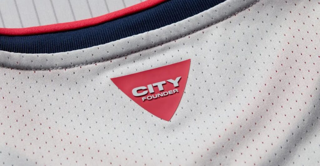
29. St. Louis City SC – The Spirit

Just when you thought we were done with the drab light-colored kits that need an entire PowerPoint presentation to justify their existence, we get what is essentially the last remnant of that generation. The fact that it even comes with the old Adidas logo should tell you that these kits have been sitting in a warehouse at least a year or two. St. Louis City SC declared that for their inaugural season, their Arch Gray secondary kit, dubbed The Spirit, is a tribute to every founder of the club, since Day 1.
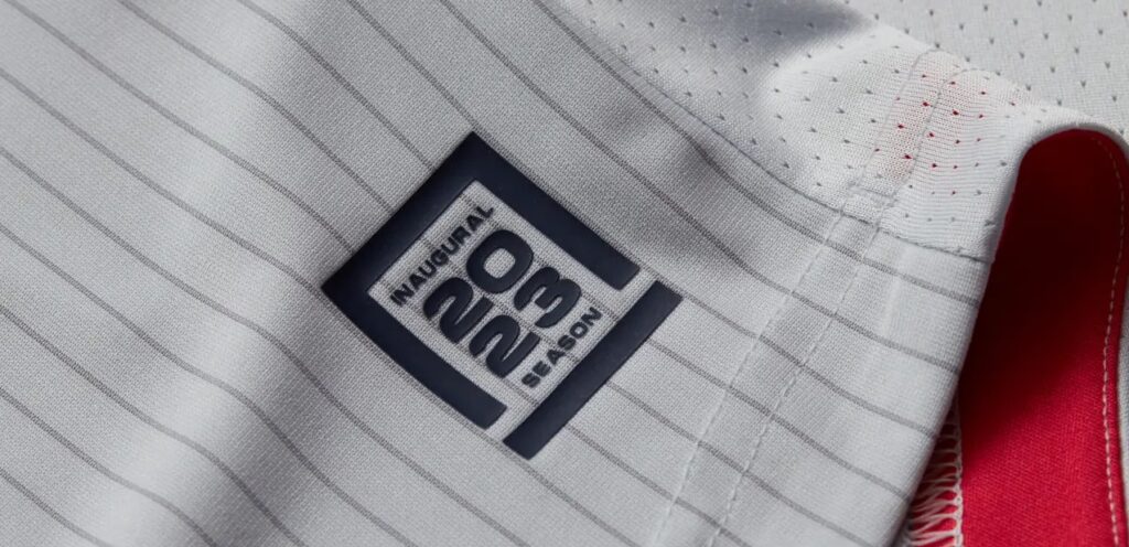
However, it has all the character of steel beams, which also “inspired” its languid design and barely there pinstriping. The jock tag has an outline of Citypark, St. Louis’s new stadium, while a graphic shaped like the keystone piece, found at the very top of the Gateway Arch is on the neck with text that reads “City founder.”
Considering the price of 2023 MLS kits, St. Louis fans are better off spending their hard-earned money on their other new kit.
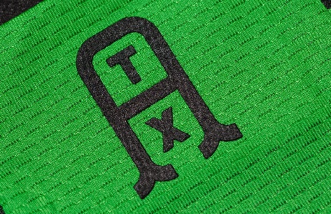
28. Austin FC – Las Voces

Arrgh! Hnnnng… *seizure sounds*
In all seriousness, how did this vapid, vexing visage of visual vomit get green lit so it could violate our existence with its seizure-inducing vengeance on the senses? Austin FC claims their Las Voces Kit is supposed to represent a “coming together of voices from across Austin.”
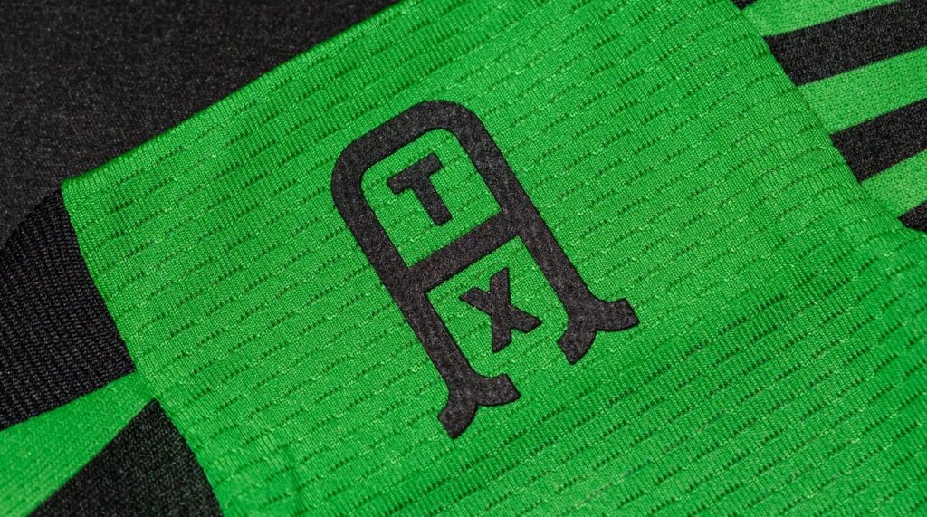
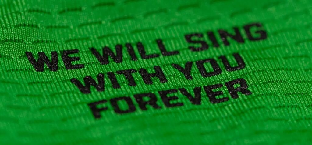
A couple of features include a new ATX logo on the back of the neck and a lyric from a supporters’ song, “We Will Sing With You Forever,” on the inside of the neck.
But the messy patchwork of stripes of varying sizes makes it look more like an old television test pattern from a Lovecraftian universe or, better yet, like a scrambled cable signal (if you know you know).
27. Red Bull New York – The Daniel Patrick

Look, we get it. New Jersey… err… uh… New York is grimy and gritty but did the new Red Bulls kit have to look like it washed up from the shores of the infamously polluted Hudson River?
Actually, RBNY got Australian sportswear designer Daniel Patrick, who calls Los Angeles home, to create what looks like a tetanus-infected mechanic shop rag. Oh, but if you look closely, you’re supposed to notice small details, like Daniel Patrick’s autograph on the jock tag. I’m not sure I want to get within smelling distance of this thing.
If for some reason you like Daniel Patrick’s gnarled brainchild and want more of his sportswear, get ready to shell out $195 for a 3-pack of standard T-shirts, a dollar over the price for a 2023 customized MLS kit. Hey…wait a minute!
26. Los Angeles FC – The Smokescreen

What is this mess? You don’t celebrate a club’s success by punishing them with this abomination.
Smoke? Smoke? Looks more like vomit and mucus from inhaling too much smoke. LAFC merited something fitting of the title of MLS Cup Champions. Instead, they will be saddled with what is being passed as paying homage to LAFC’s smoke-filled (yet Don Garber-approved) goal celebrations.

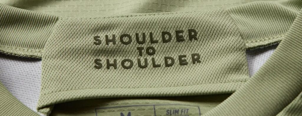
The jock tag features a graphic of a globe and reads “World’s City World’s Game” while on the inside of the neck you will find an inscription that reads, “Shoulder to Shoulder.”
The LAFC logo has been simplified, sans the shield, and stands well on its own. It’s a design element used with other 2023 kits to good effect. And, yeah, the Chivas USA/LAFC fans finally get that star they’ve been pursuing since 2005, but sadly it gets lost in the smoke.
25. FC Cincinnati – The River

It was going to be tough for FC Cincinnati to surpass the sleek and elegant 2021-22 Dynamic Kit. The River Kit just isn’t it.
It pays homage to the Ohio River, which explains what looks like an oil stain smeared across the front like some mucky sash. Supposedly it showcases famous landmarks throughout Cincinnati, but the only other noticeable detail is on the jock tag—a depiction of the John A. Roebling Suspension Bridge, which connects Cincinnati to Covington, Kentucky.
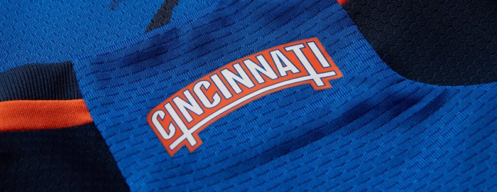
There’s a Cincinnati wordmark on the neck, stylized to look like “bridges that connect” Cincy communities. But, in the end, this kit is not memorable, just water under the bridge.
24. Toronto FC – Club

How do you ruin a Toronto FC kit when you have such a great palette at your disposal? As TFC fan Adam Iafrate (@CratesOfFrates on Twitter) responded, “They found a way, man.”
It baffles the mind how a club affectionately nicknamed “the Reds” by TFC supporters will lack a primarily red home kit. The Club Kit isn’t particularly bad. It has red shoulders and sleeves. Thin red lines border onyx hoops, which are meant to represent TFC fans and supporters.
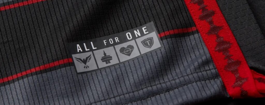
A “sounds of the stadium” soundwave is woven into the side-seam and the jock tag bears TFC’s “ALL FOR ONE” slogan with symbols representing the club, city, house, and supporters. But to Iafrate, the shortage of red kills it for him.
“There isn’t any red at all in our away strip [2022-23’s gray TFC Community Kit] so, to see them turn red into a secondary on our home kit is just a huge mistake,” he explained. “I absolutely hate it.”
Is it coincidence that the Club Kit is practically the polar opposite of the 2017 TFC kit, which Iafrate considers the golden standard? Here’s hoping that two years from now, TFC goes back to their red roots.
23. FC Dallas – Burn Baby Burn

For a kit that is meant to pay tribute to the club’s roots as Dallas Burn and the legendary mustang spitting fire, the FC Dallas Burn Baby Burn Kit feels more like a weak, fading ember.
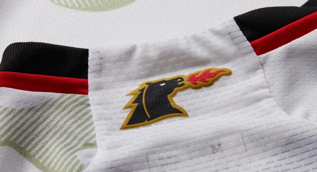
Oh, there’s a spark here and there. The fire-breathing mustang, found on the neck, is a familiar image for day-one MLS fans, and FCD pays tribute to the late, great Lamar Hunt with a jock tag bearing his initials.
There is also some red piping along the side-seam which continues along the hem, and another dash of red bordering part of the kit’s black collar. However, the rest of the kit borders on the edge of the white kit chasm and is barely saved by the use of the mustang’s flame as a silly pattern across the front, shoulders, and sleeves, but they kinda give off a Trogdor the Burninator vibe.
This entire kit was a missed opportunity. They could have at least dressed up the FCD logo in the old Burn colors, but instead it looks gray and sad.
22. Vancouver Whitecaps FC – Bloodlines

There are three constants across the history of the MLS Vancouver Whitecaps: passionate supporters, a beautiful stadium in BC Place, and exquisite kits. They always nail the kits.
One of the most effective aspects of Whitecaps kit design has been the use of the logo of Bell Canada, their longtime sponsor. Despite the sizeable yet simple Bell logo, it always fit the aesthetic of the Whitecaps kits. But, for 2023, Bell is absent from the Bloodlines Kit, having been replaced by Telus Communications.
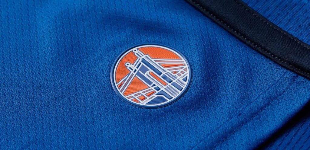
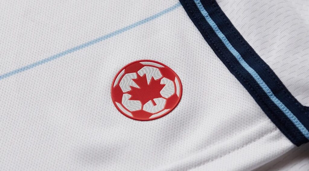
On its own, the modest TELUS logo isn’t glaring, but the addition of thin red stripes above and below mark the first time Vancouver uses red (the Bloodlines) in this manner on their MLS kits. Other design aspects include very thin, horizontal light blue stripes, two shades of blue along the side-seam and along the hem, and the use of the first Whitecaps FC logo from 1974—a red ball with a maple leaf in the middle—as the jock tag.
There is nothing wrong with the Bloodlines kit but it’s missing a certain intangible that makes it stand out like previous home kits.
21. Minnesota United FC – Northern Lights

Aurora borealis?!
Cue the countless iterations of the “Steamed Hams” skit from The Simpsons episode “22 Short Films About Springfield.”
All jokes aside, Minnesota United FC made a brave attempt at trying to depict the greatest light show on the planet with the Northern Lights Kit, which begins with a white base and becomes dramatically more vibrant as you go up.
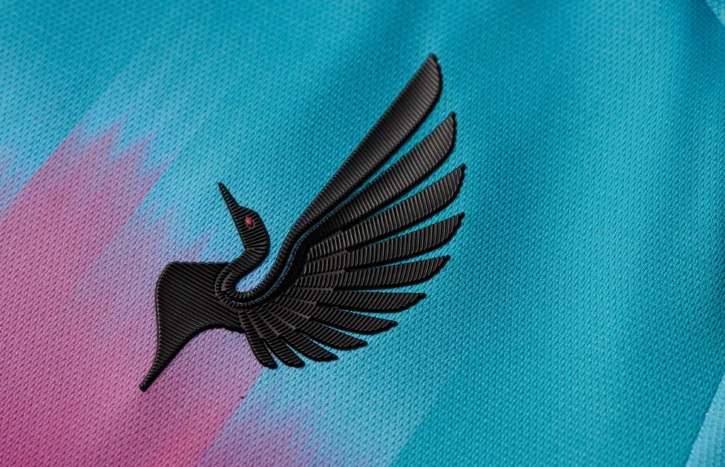
Like LAFC, Minnesota United’s logo has been streamlined, leaving their trademark Loon logo without the shield or Pole Star—the latter having been moved to the neck. The result is a kit that resembles an abstract art project and is initially captivating, but that feeling fades after a while.
It’s worth noting that USL W League club Minnesota Aurora FC did it first and—by far—did it better. Their 2022 inaugural home kit is stunning. Cop one while you can.
What do you think about this first group? Are there any kits that you think deserve to be higher on the list?
Next up, No. 20 – 11.
(All images are the property of Major League Soccer)
Related Post
The 2024 MLS Kit Golden Age
By Edgar Zuniga MLS and Adidas did it again. Last season continued the renaissance of [...]
The Fascinating True Story Behind the 2021 Community Kit and the “Amor Eterno” Video and Their Impact on Los Angeles Galaxy Lore
A SOUTHERN CALIFORNIA STORY By Edgar Zuniga This is a story about the now-legendary Los [...]