The 2023 MLS Kit Renaissance, Part 2
By Edgar Zuniga
After reviewing some less desirable designs ranked no. 30 – 21, we get start to get into the meat and potatoes and ranking the 2023 MLS kits becomes a bit more difficult. None of these are bad-looking, they just don’t stack up to the Top 10.
20. Philadelphia Union – For Philly

Philadelphia Union claims that the design on their mostly tan For Philly Kit is a camouflage pattern inspired by Union’s run to MLS Cup ’22, but, in a case of “once you see it you can’t unsee it,” the pattern is very familiar to the famous cloudy intro from The Simpsons.
D’oh!
Maybe the For Philly Kit symbolizes clearing the air from the LAFC Smokescreen. Maybe it represents what follows after the lightning storm of the flashy BY/U Kit from 2021-22.
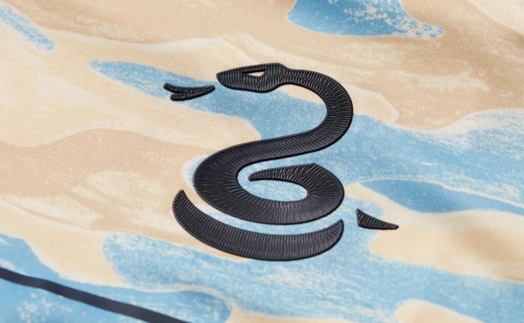
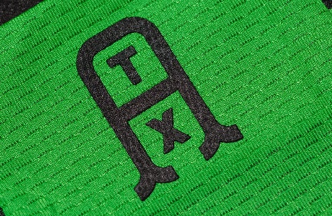
Similar to LAFC and Minnesota United FC, the Union logo on the front has been reduced to the Philly serpent, with the primary Union logo found on the neck.

The previous sponsor, Artesano, has been replaced by Thomas’, which is known for their English muffins and bagels. FYI: both Artesano and Thomas’ are owned by Bimbo Bakeries, which continues to use their smirk-inducing logo on the Union’s primary. While it’s not going to catch league-wide attention like its predecessor, the For Philly Kit gives Union a unique look and might become a cult classic if the club maintains its current run of improvement.
19. Columbus Crew – VeloCITY

After the dull gray 2021-22 secondary Inaugural Stadium Kit, Columbus Crew returned to their traditional colors for their primary, unveiling the sharp Gold Standard Kit.
This year, Columbus unveiled a black-on-gray kit with an angled, frenetic checkerboard design representing “speed, velocity, and movement,” qualities shared by the club and the city of Columbus. The kit evokes a more energetic vibe and is further distinguished by yellow accents that complete the look.

Other details include the club’s motto, “Never stand still,” inscribed into the yellow side-seams and a stylized wordmark “The Crew” used for a jock tag.

The new Crew logo still sucks but the VeloCITY Kit checks all the boxes and will pair well with the Gold Standard Kit in 2023.
18. Sporting Kansas City – Hoops 4.0

The biggest reclamation project in MLS history, Sporting Kansas City has put out some of the more memorable kits in MLS throughout their existence, with hoops being a recurring theme.
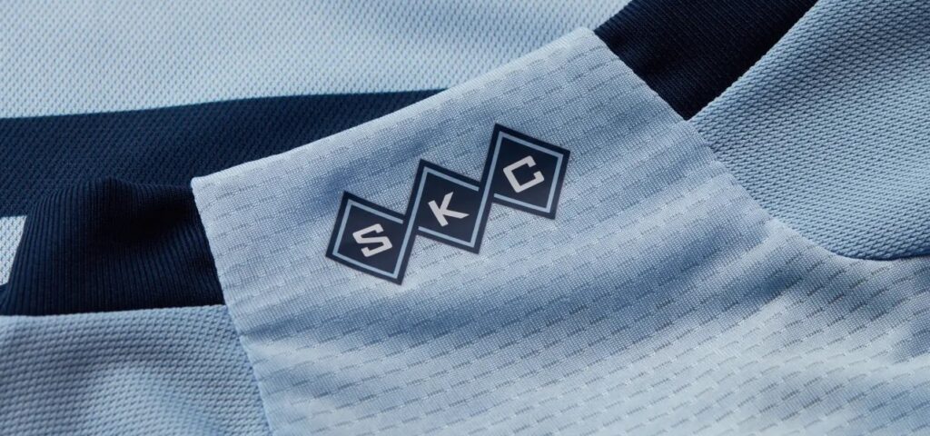
The Hoops 4.0 primary kit continues that tradition with a very clean, aesthetical design featuring a light blue base with thin dark blue stripes. On the neck, the initials SKC are interwoven into the distinctive argyle theme that Sporting KC has used before on gorgeous third kits from 2014 and 2015.
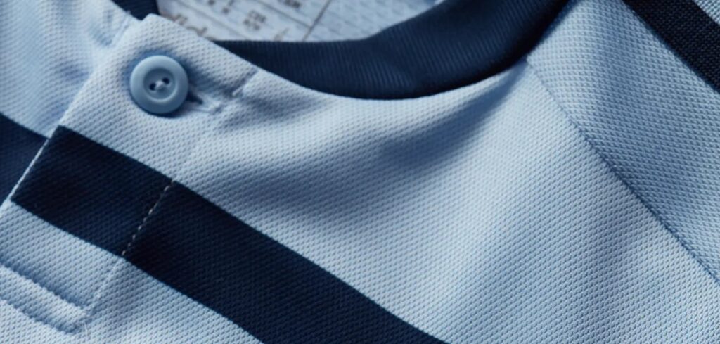
There is absolutely nothing wrong with this kit. If anything, detractors might say the Hoops 4.0, with its button collar (the only one among the new kits to have one), gives off a preppy vibe, but that’s just a perfect example of timeless style.
17. Inter Miami CF – La Noche

Despite having the most unique color palette in MLS at their disposal, Inter Miami CF wore a pair of disappointing, uninspired, and boring kits for the first two years of their existence.
Since then, the club has gradually embraced their identity, beginning with the lavishly pink 2022-23 Heart Beat primary kit. In 2023, Inter Miami presents an upgraded version of their sleek black 2021-22 La Palma secondary kit, dubbed La Noche. The city of Miami is famous for its energetic nightlife and this kit is meant to represent that, featuring an embossed wave pattern that almost serves as hoops on the kit.
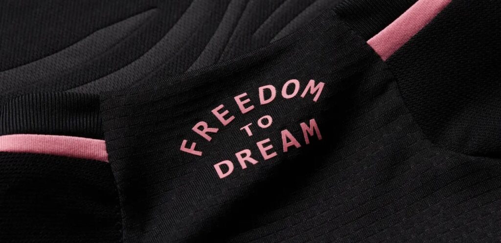
Other details include the watermark, “Freedom to dream,” on the neck while the jock tag is a stylized “M” logo formed by the herons on the Inter Miami logo.
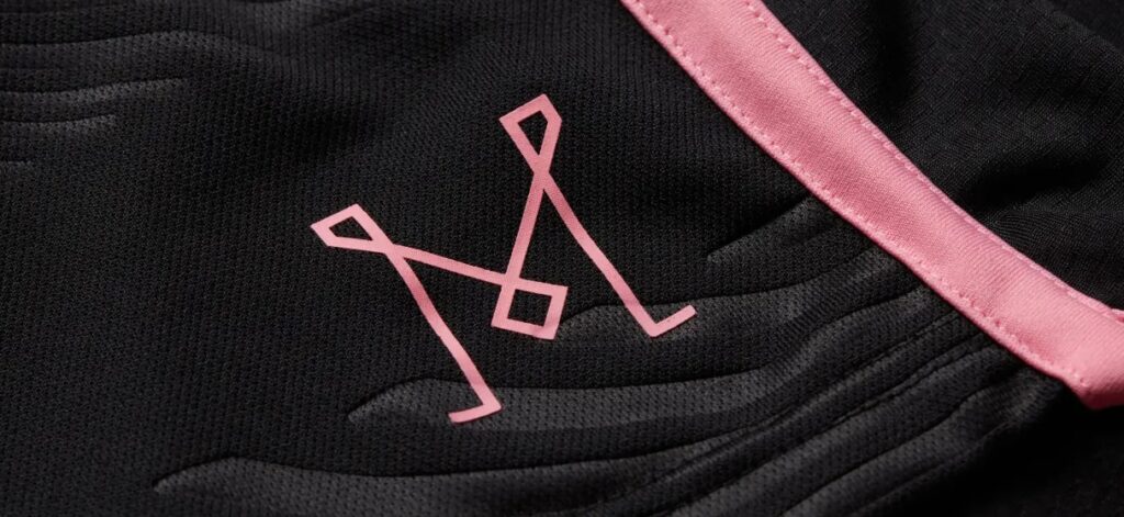
Pink highlights on the neck, cuffs, side-seam, and hem complete the look of this beautiful kit.
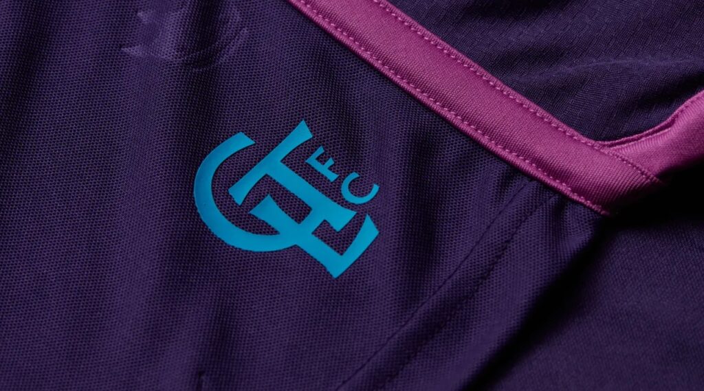
16. Charlotte FC – Crown Jewel

Adding purple and pink to their color palette, Charlotte FC has unveiled the extraordinary Crown Jewel as their secondary kit for 2023.
There was a palpable sense of concern among Charlotte FC fans when word spread that the club was ditching the very popular Newly Minted Community Kit from their inaugural season. The jury is still out about whether or not the Crown Jewel Kit is a worthy successor, but CLTFC Fan TV podcast co-host Lee had to see it in person to get a real appreciation.
“I’ve seen it for a bit now,” he admitted. “I like it…looks better in person.” When pressed to choose between Mint or Purp, Lee chose the latter. “The little touches on it are cool and definitely look better in person that pics on the Web.”
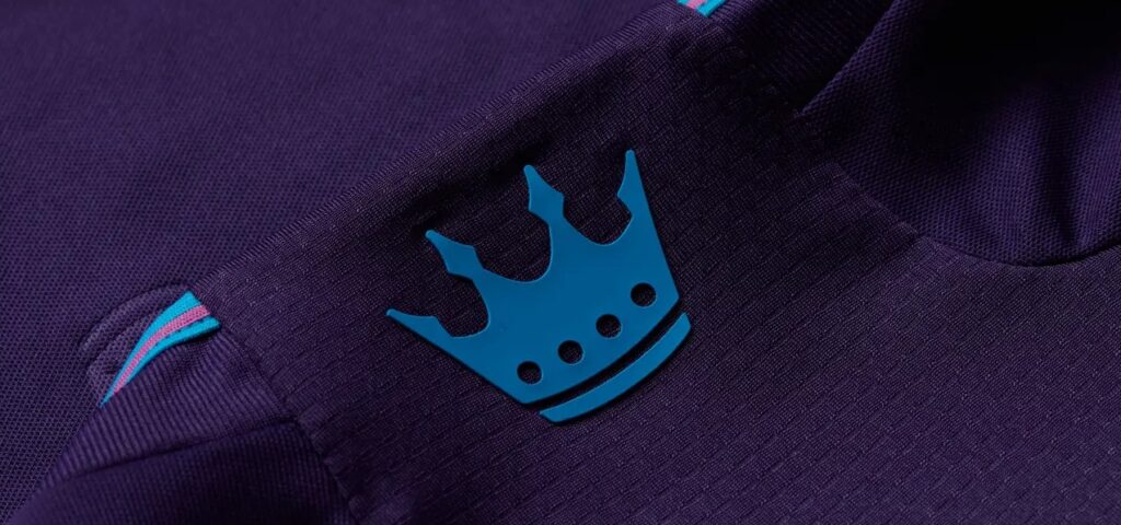
Features include an embossed Charlotte FC crown pattern adorning the kit, with the crown from the Charlotte FC crest prominently displayed on the neck, and the Charlotte wordmark logo on the jock tag. Carolina blue and pink highlights on the neck, cuffs, side-seam, and hem give just the right amount of added flavor…like a familiar breakfast pastry.
“Even the club is joking about it looking like a Wild Berry Pop-Tart,” Lee quipped, adding, “Overall, I think it’s getting some love. It’s one of those kits that grows on you.”
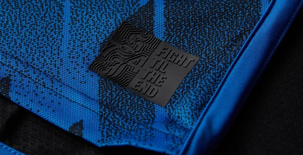
15. San Jose Earthquakes – Active Fault

Existing whether in physical or spirit form since 1974, you would think that the San Jose Earthquakes would have had some memorable kits across their various iterations. But the Quakes have mostly played it safe with their last pairing of primary and secondary kits being plain blue and white, respectively.
In particular, their current secondary kit, which carries over to this year and is dubbed The Creator, is anything but creative—a monochromatic black and white blah. In stark contrast, 2023’s Active Fault Kit is very exciting.
The traditional dark blue Quakes primary gets a much-needed jolt with black streaks and jagged angles, forming a tectonic plate pattern that looks familiar upon closer inspection… Hey, wait a minute! This is just a different take on Real Madrid’s 2022-23 away kit! Eh, it still works for the Quakes.

A simple “San Jose” wordmark is on the neck, while the jock tag features the Quakes’ motto, “FIGHT TIL THE END” and “SJ74.”
It is definitely one of the better kits the Quakes have had in recent memory and could quite possibly be their best ever.
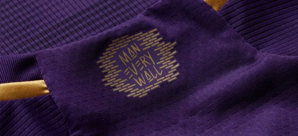
14. Orlando City SC – The Wall

Although Charlotte FC and Seattle Sounders FC have incorporated purple for their kit design, the color of royalty in MLS belongs to Orlando City SC, who have put out pristine purple primary kits since joining the league in 2015.
For 2023, Orlando City pays homage to their fans and their supporter section at Exploria Stadium with their exquisite The Wall Kit, which features an embossed brick wall pattern on the front and the “MAN EVERY WALL” wordmark in stylized font superimposed over a brick wall on the neck.
With gold trim (including the shoulders stripes and sponsor logo), this is quite simply a clean, elegant kit with a regal appearance, appropriate for the reigning Lamar Hunt U.S. Open Cup Champions.
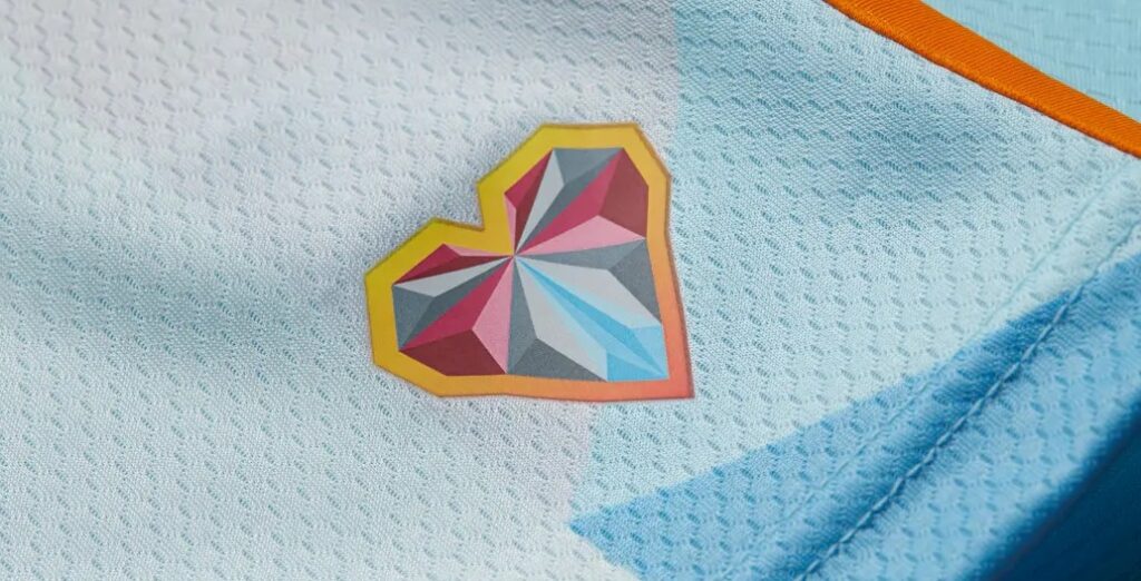
13. Colorado Rapids – New Day

Known for their solid and unpretentious burgundy primary kits, Colorado Rapids have also put out some eye-catching secondary kits in recent memory, such as their colorful 2013 and 2018 kits. They’re also one of the rare teams in MLS that have successfully pulled off the more light-colored kits, with their elegant white 2019 and light green 2021 versions.
But, for 2023, the Rapids tried something different. Rapids fan and writer for SB Nation’s Burgundy Wave Joseph Samelson (@jspsam on Twitter) explains what makes this new kit so special:
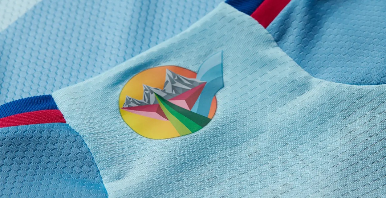
The Rapids made a return to a sky-blue away shirt for the first time in 13 years by announcing The New Day Kit. The bold look is far from the plain away jerseys that the league has afforded fans in the past and takes inspiration from the colorful skies of Colorado. A unique collaboration with local street artist Pat Milbery, the New Day kit was produced with a focus to raise awareness on mental health issues in Colorado. The club will be donating $25,000 to nonprofits serving mental health needs around the state in conjunction with the launch of the kit, making this a shirt worth repping on and off the pitch.
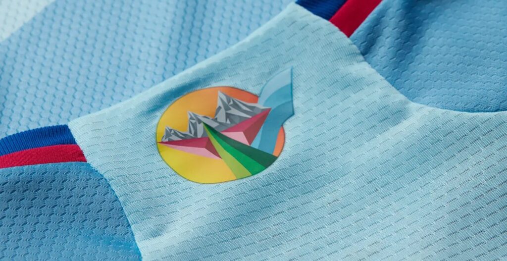
Design details that stand out are a prismatic sunset icon on the neck and a kaleidoscopic heart logo as a jock tag.
In addition, Rapids fans will have an opportunity to get free customization of their New Day kits with vibrant limited-edition numbers designed by Milbery.
“I think it’s well-done,” Samelson said. “They did like six-plus years of Colorado flag-based kits during the 2010s, so I’m glad they decided to do something different. I think they incorporated the colors well.”
12. Chicago Fire FC – Kit for All

Incorporating colors from the flag of their home city, Chicago Fire FC’s Kit for All, has unique details that make it one-of-a-kind among MLS kits.
First off, for the first time in club history, the Fire crest is centered on the kit. But what really makes it stand out is the design, which calls to mind confetti, with various diamonds and chevrons in red and light blue framing the Fire crest and breaking the monotony of what could have begun as a simple white kit.

The neck features the Fire secondary logo, and the look is capped off with blue trim on the cuffs and along the side-seams and hem. With a distinct style for their secondary, here’s hoping that next year, Chicago Fire finally ditches blue and returns to their trademark fire engine red primary kits.
11. New England Revolution – Defiance

With leaks floating around cyberspace since last year, New England Revolution’s Defiance Kit caught everyone’s attention due to its departure from not just typical Revs kit design, but MLS in general. It was the first real hint that the kit game in MLS was about to change.
The Defiance Kit is in a whole different dimension than their tepid gray-on-gray 2021 secondary kit, which was dubbed The Fort and was supposed to be inspired by the blockwork of the American Revolution era, and was dedicated to the supporters’ section at Gillette Stadium. In reality it was just a grayscale version of Spain’s 2020 kit, slapped with a stretch of a PR spin that never fooled anyone.
Many detractors have been quick to point out that the Defiance Kit is similar in style to the iconic Club Atlético River Plate uniforms or the Peruvian National Team. However, New England’s bold red strikethrough sash (like the one on the new Revs crest) takes on a different identity once you notice the strafing gradients of red that go beyond just a simple sash. The club claims that this dominant feature embodies “that resilient spirit that sparked the American Revolution…”
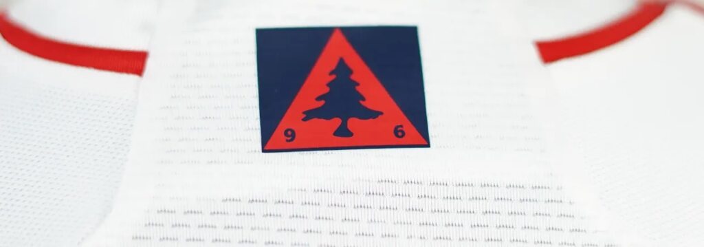
Also, for the first time, a Revs kit features the Heritage Tree, paying homage to the flag of New England, which is proudly displayed on the neck. Easily, this is the most eye-catching Revs kit since their wild Reebok kits from 1996 and ’97.
There you have it! There were some good kits in this group, but they just couldn’t crack the Top 10, which I will review soon enough! Are there any kits in this list that made your Top 10 or should have been ranked lower?
(All images are the property of Major League Soccer)
Related Post
The 2023 MLS Kit Renaissance, Part 3
By Edgar Zuniga After going from 30 – 21 and 20 – 11, we finally [...]