The 2024 MLS Kit Golden Age, Part 2
By Edgar Zuniga
After a few duds from the bottom of the ranking, it got more difficult ranking no. 29-21. So, you can only imagine how much more difficult it gets from here on. All of these kits are fantastic in their own right but they just happen to fall short of the Top 10.
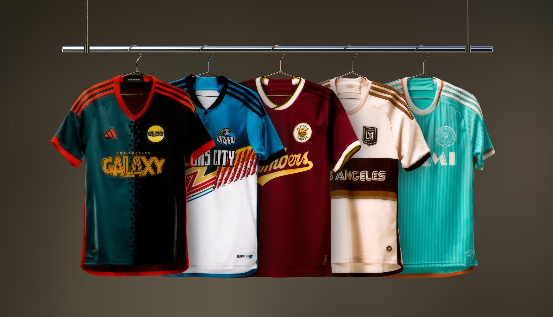
19. LA Galaxy – Angeleno Kit

For the first time since the divisive 2020-21 “25th Anniversary” primary kit, an LA Galaxy kit will feature a sash…sort of. The famous sash, which had become emblematic of success during the club’s halcyon days was inadvertently absent from their last primary kit, the practically barebones “City of Dreams” kit from ’22.
As the club undergoes their own renaissance after a tumultuous 2023, the club unveiled their new primary for the next two years. Dubbed the “Angeleno Kit,” it offers a unique design with a white base and thin diagonal pin stripes that radiate from an empty, diagonal space that doubles as a sash.
Josh Guesman (@jguesman), host of Corner of the Galaxy (@GalaxyPodcast), sees the Angeleno Kit as a sign of better things to come.
“It’s a return to the idea of a successful team,” he remarked. “It’s a whisper of a sash. It’s a hint at better times ahead, but this team hasn’t earned the sash back. So, it’s almost like a placeholder for what could be. The yellow highlights instead of the blue make it different and the radiating lines give pinstripes a new name. Overall, I love the concept, and think it was executed well with thoughtful details and the fans in mind.”
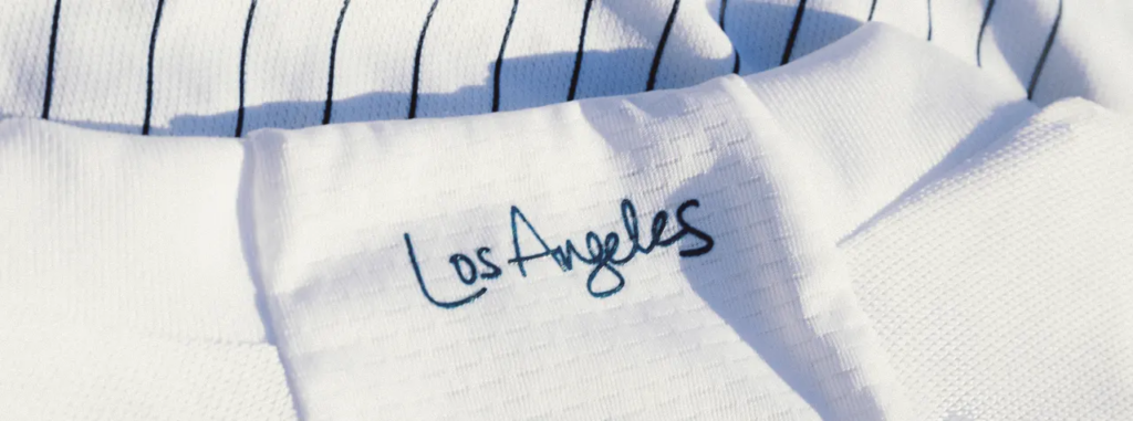
Yellow striping on the shoulders and on the piping along the sides complement the Galaxy badge and give the Angeleno Kit a splash of color. “Los Angeles” in script is found on the back of the neck and the trademark Galaxy quasar, which is also found on the L.A. County flag, serves as the jock tag. Now imagine this kit with a better sponsor and it would have been higher up this list.

18. Nashville SC – The 615 Kit
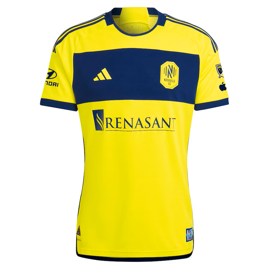
Nashville has put out solid kits since joining MLS in 2020. But after two iterations of gold primary kits, they switched things up this year with “The 615 Kit,” which features a prominent broad dark blue horizontal band across the upper chest, so the Nashville SC badge immediately catches your attention.
The kit gets its name from the 615 area code—which covers a large swath of north-central Tennessee, including Nashville and many other communities—and celebrates all the fans that live therein. Dark blue stripes on the shoulder, neck, cuffs, and on the piping along the sides help balance out the gold and blue on the body of the kit.
A graphic of the 615 area code with Nashville’s Cumberland River, above three stars from the state of Tennessee flag, is found on back of the neck, while a “NASHVILLE” graphic with the Cumberland River running through it serves as the jock tag. Nashville SC get huge bonus points for an idea for their home opener when players will wear individual Neighborhood Patches on the back of their kits, with the match-worn jerseys to be auctioned off later this year to benefit the Nashville SC Community Fund. On top of that, all 35 neighborhood and community patches will be available for fans to purchase at GEODIS Park.

Like many of the others in this tier, there is nothing inherently wrong with this kit, but Nashville could have gone a bit further and done something extra with the blue band. Perhaps an embossed pattern or graphic referencing the city’s rich musical history or a city skyline? Nevertheless, Nashville will be instantly recognizable when they hit the pitch.
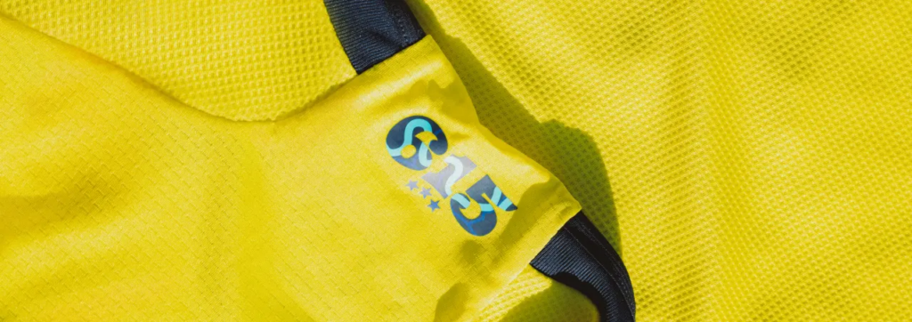
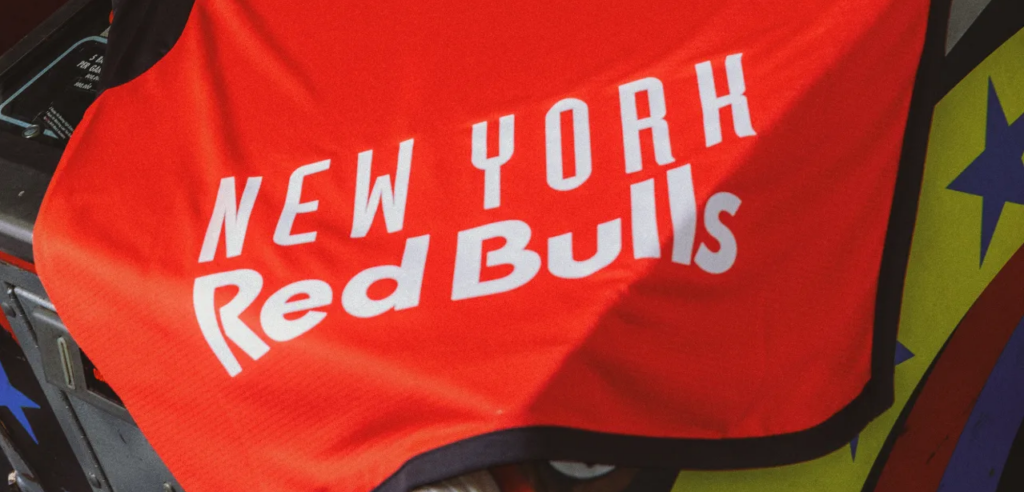
17. Red Bull New York – Legacy Kit
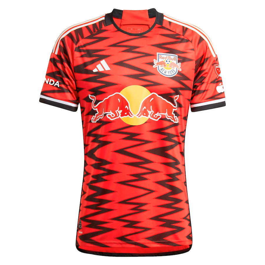
Red Bull New York can post a video where they blab about how their new jersey represents their most loyal supporters and their community. But, in all honesty, they could have just said “Hey yooz guys, here’s our new kit. Buy it.”
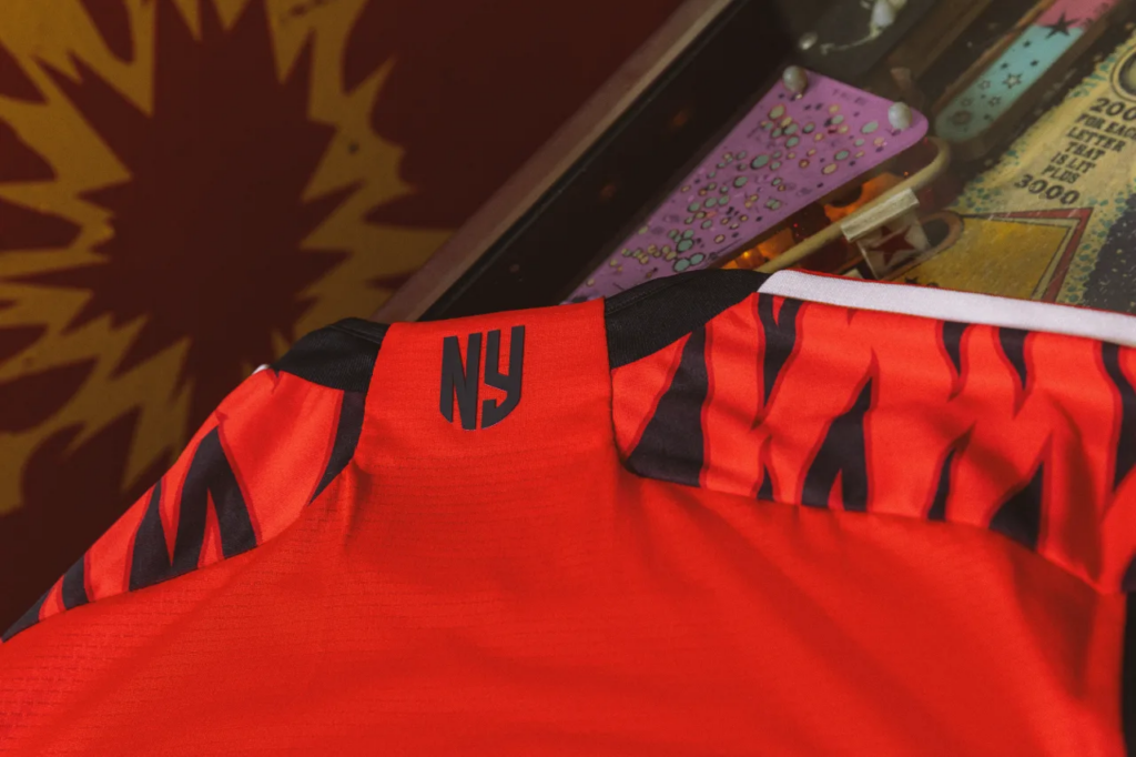
Despite all the bells and whistles attached to kit launches, RBNY’s new “Legacy Kit” is simply extraordinary. While NYCFC’s new “24/7 Kit” comes off as timid, the Legacy Kit is loud and aggressive. Sharp zig-zagging vertical stripes scream at you and could almost double for piercing urban soundwaves. The rest of the kit is composed of white stripes on the shoulders, contrasting black and white cuffs, and black on the neck and on the piping along the sides. An “NY” graphic is found on the back of the neck and the large trademark “NEW YORK Red Bulls” moniker is found, as usual, on the lower back of the shirt.
After unveiling their highly acclaimed, graffiti-scrawled third kit celebrating New York hip-hop midway through ’23, the Legacy Kit almost serves like a follow-up that could have celebrated New York hardcore, metal, and punk. But the folks at RBNY chose a more mainstream route and dedicated the kit to their fans and there’s nothing wrong with that.
16. Los Angeles FC – Primary Kit
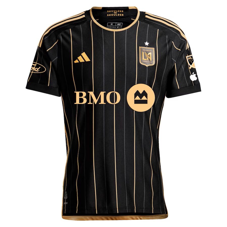
Since being rebranded as Los Angeles FC, this franchise has yet to put out a kit that can be considered a classic. Their 2022 “5 Years Strong” jersey with its graduated Art Deco pattern was a bold attempt, but stacking the Adidas logo and club’s badge in the middle above a massive sponsor logo ruined what could have been a good shirt.
This time around, LAFC focused so much on putting together what is arguably their best kit yet that they didn’t even bother with some cute or contrived nickname for the shirt, simply calling it the “Primary Kit.” Despite its inauspicious name, it’s a very clean, eye-catching kit with a black base and interchanging thin and thick gold pinstripes that also extend down the arms. It’s a bit similar to the ’16 Montréal Impact kit (even with the same sponsor) and some will compare it to LA Galaxy’s legendary ’21 “Community Kit,” but LAFC’s Primary Kit does enough to stand on its own.
LAFC X (@LAFC_X) approves of the new kit but thinks the pinstripes are too much: “Not the biggest fan of the pinstripes but overall, the new kit is solid. Minimalist and classic. It’s all in the details.”

The adidas and club logos are exactly where they should be and having the BMO logo in the same shade of gold helps immensely. The secondary LAFC logo, which features on their secondary kit, is now found in gold on the back of the neck while “Shoulder to shoulder” is on the inside of the neck. There are more flourishes of gold on the shoulder stripes, neck, and on the piping along the sides, completing a kit that will become a favorite among LAFC fans.
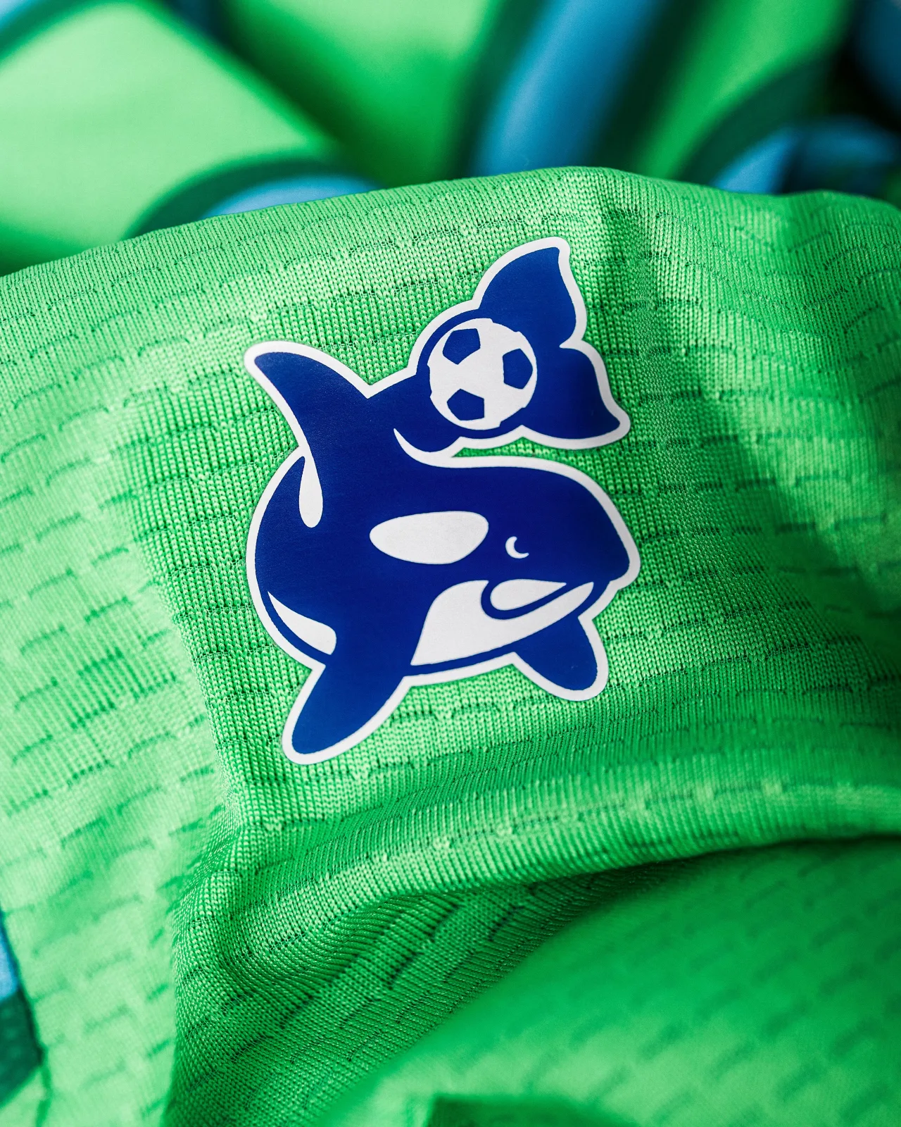
15. Seattle Sounders FC – The Anniversary Kit
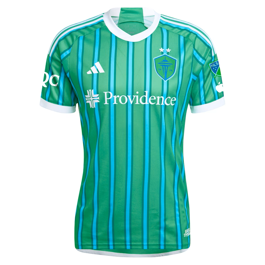
The new Seattle Sounders shirt will likely find its way into the top 5 of many ’24 kit reviews, but I think that is due to it being so different from any kit any MLS team has used in recent memory. However, it must be said that it does give off strong ’98 Tampa Bay Mutiny home kit vibes. They’re almost the inverse of each other.
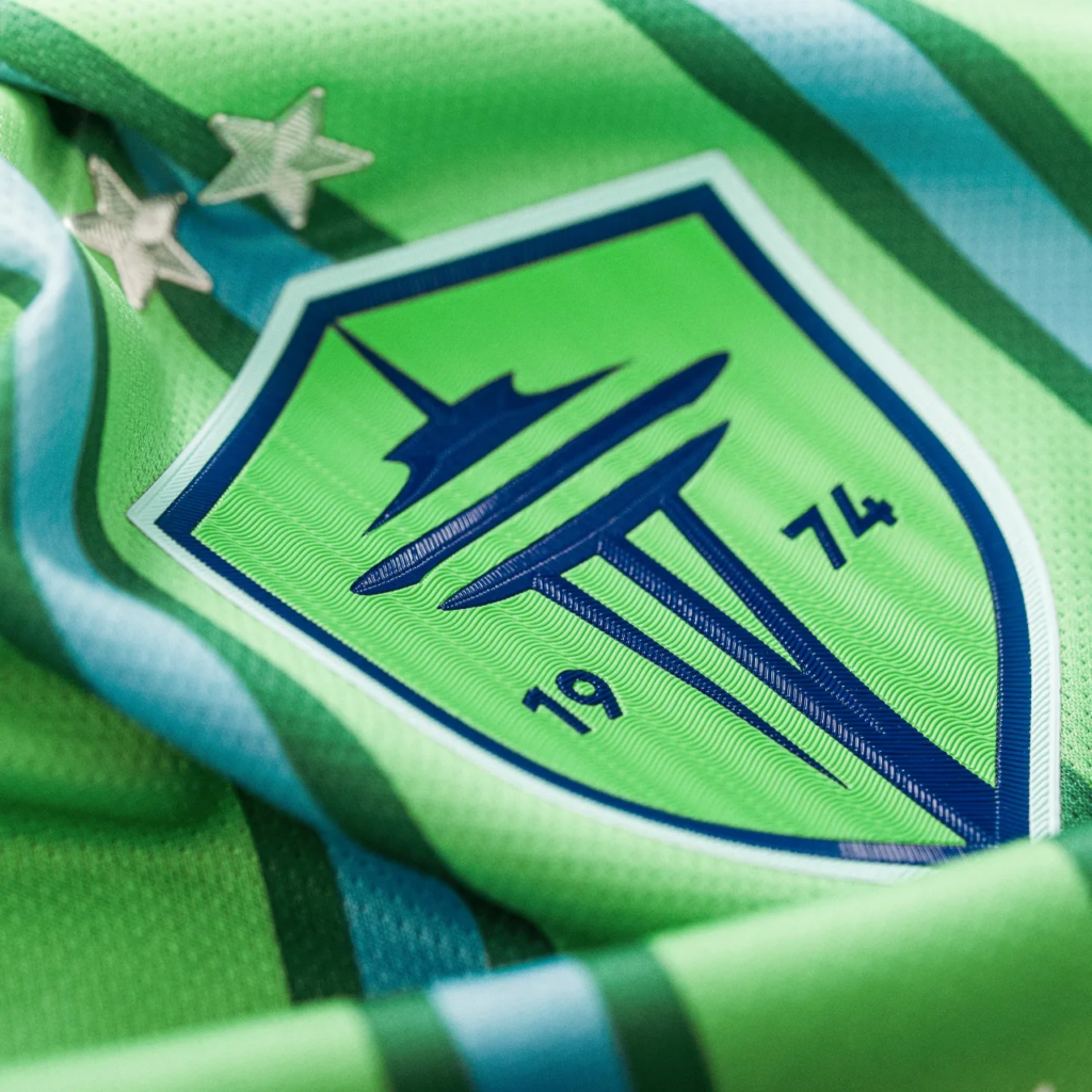
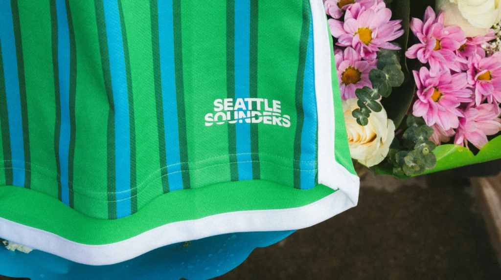
Like other former NASL clubs that got their start in ’74, Seattle’s “The Anniversary Kit” celebrates 50 years of existence. Whether it was in the NASL, APSL, A-League, or USL First Division—indoors or outdoors—the Sounders have long been a fixture in the Pacific Northwest, and The Anniversary Kit honors players and fans throughout those five decades with a nod to the team’s colors from the past.

As mentioned earlier, it’s similar in style to the ’98 Munity home kit, except that it employs the club’s new muted primary green as the base while the dual pinstripes pay homage to the NASL era. White stripes, neck, cuffs, and piping along the sides offer some balance. The Anniversary Kit will be the first to employ the new streamlined Sounders badge and also features the club’s secondary logo, an orca with a ball, which is a tribute to Sounders logo from the ‘90s. The Sounders logo prior to their jump to MLS is featured on the jock tag.
14. DC United – The Icon Kit
I dare you to go down the entire history of DC United kits and find a bad one. DCU’s kit game is iconic, and you can add another one to the list with 2024’s “The Icon Kit.” You’d think the new shirt was named in honor of the club putting out banger after banger of memorable jerseys, but it has a much deeper meaning.
According to DCU, “The Frederick Douglass Memorial Bridge, located just blocks from Audi Field, serves as the model for The Icon Kit—driven by the goal of connecting local communities, bridging the club’s past with its future, and reaching new fans.”
And, my goodness, the Icon Kit is an obsidian beauty. Inspired by the architecture of the Frederick Douglass Memorial Bridge, its distinctive features are wavy horizontal stripes in varying shades of black across the front and arms. The bold red on the stripes, neck cuffs, and on the piping along the sides complete this visual masterpiece.
Meanwhile, the back of the neck features a graphic with the bridge itself along with DC United’s mantra “UNITE THE DISTRICT,” which is also featured on a red square with the DCU eagle for the jock tag.
13. New England Revolution – Boston Tea Party

Owner/investor Robert Kraft might still not remember he owns an MLS team but at least someone in the front office cares enough to ensure New England Revolution is looking good when they take the field
After last season’s “Defiance” kit signaled the beginning of a new era for MLS kits, there was a sense of anticipation for what the Revs would get for their new primary for ’24. The “Boston Tea Party Kit” embraces more of the lore that sparked the American revolution against the British, and despite the funny name, this shirt stands out as one of the more exceptional kits in Revs history.
Red shoulders and a blue body make up the basic elements of this kit, but it’s the use of dotted white and red vertical stripes against the blue background, like bubbles emanating from a chest of tea tossed into the Boston Harbor, that give this shirt a character of its own. The red shoulders offer the perfect contrast and are complemented by white shoulders stripes and a blue neck and cuffs.

The Heritage Tree, which honors the flag of New England, is back again and proudly displayed on the back of the neck. While the white “R” from the new Revs badge on a blue background serves as the jock tag.
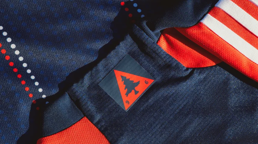
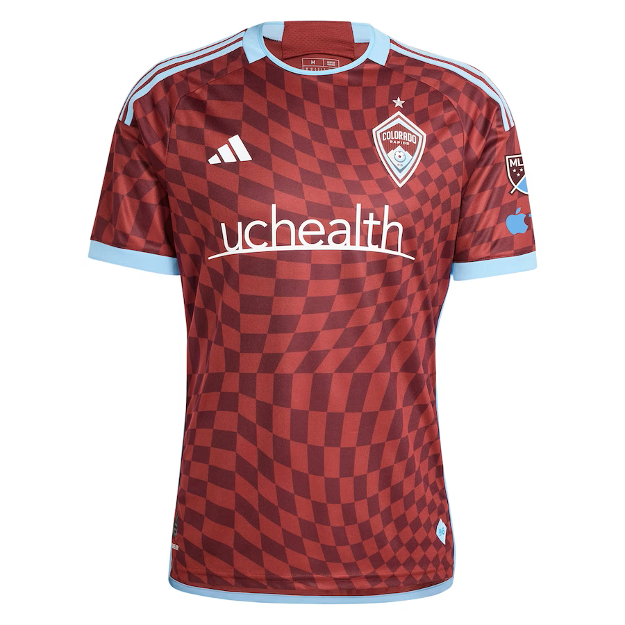
12. Colorado Rapids – One Flag Kit
The fans protested and the club listened and now Colorado Rapids is undergoing a dramatic resurgence through investment in higher caliber player acquisition and a more concerted effort to engage with Rapids supporters.
To top it off they will enter the new season with one of the more attractive kits in MLS, named the “One Flag Kit,” which is characterized by a dynamic, undulating checkerboard pattern that extends to the shoulders. Light blue shoulder stripes, neck, and piping along the sides gives this shirt a clean, sharp demeanor.
The kit gets its name from the club’s initiative to raise awareness of and provide support for access to soccer for young people and to do so under “one flag.”

Matt Pollard (@LWOSMattPollard), co-host of the Holding The High Line podcast, admires the One Flag Kit, stating, “It looks way better in person than the photos online,” and adding that “The checkerboard is sentimental to the supporters. The community initiative is a big step forward given what happened last year. Going full burgundy from shirt to shorts to socks will be different.”
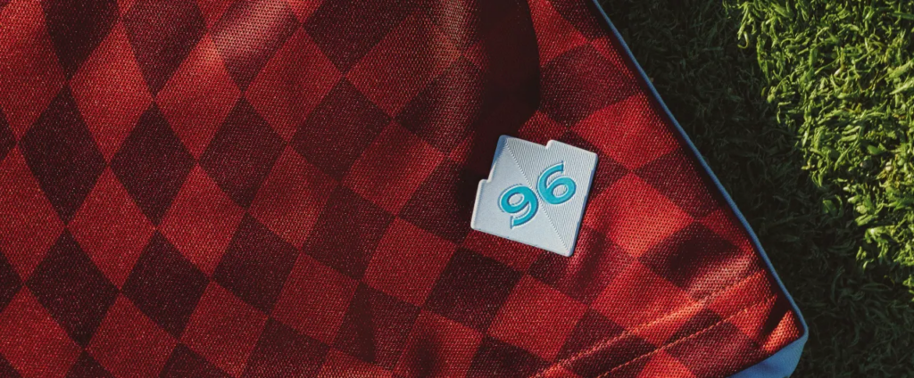
The distinctive Colorado state flag is featured on the back of the neck, while the Rocky Mountain element from the club’s badge, along with “96” in light blue, serves as the jock tag. Colorado has done a lot in the offseason to turn things around, but if they experience even a decent measure of success, then the One Flag Kit will go down as emblematic of that change.
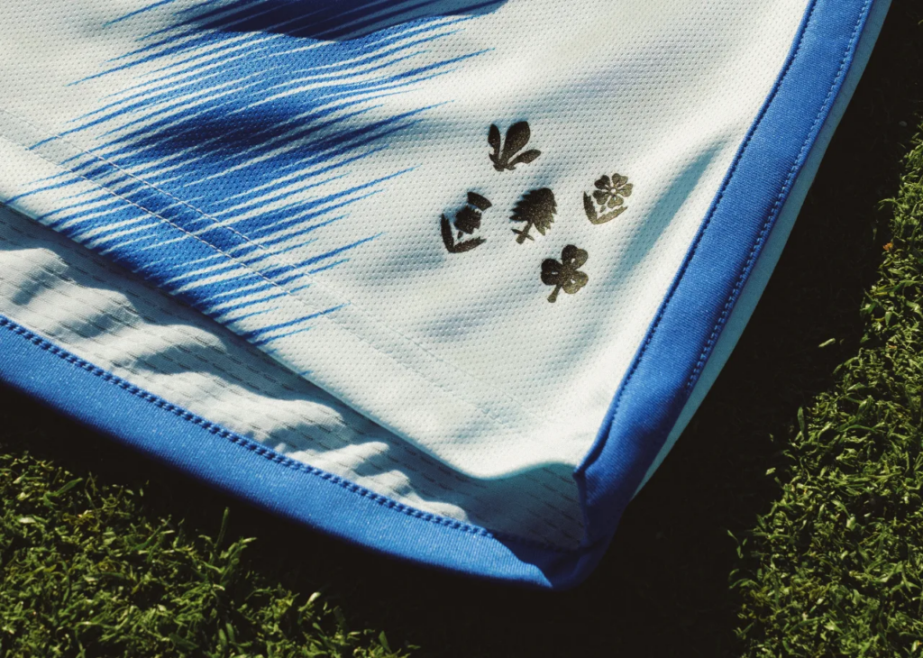
11. CF Montréal – La Main

I still think that rebranding the Montréal Impact name for the more strained Club de Foot Montréal, which was eventually shorted to CF Montréal, was a waste of time and money. The old Impact logo was fine and probably just needed to be updated a bit for a more contemporary look.
At the very least, Montréal has now put out two exquisite kits in consecutive years, although last year’s primary wasn’t unveiled until later in the season and went unranked. But for ’24, they unveiled the icy cool “La Main” kit, which is a reference to Boulevard Saint-Laurent, a main artery road that crosses the city from north to south, divides it east and west, and unites several Montréal communities.

A vertical blue stripe located along the left side of the kit is representative of La Main, while also being emblematic of the St. Lawrence river, which connects Montréal to the Great Lakes and the Atlantic Ocean. The stripe also runs underneath a frosty blue and white version of the CF Montréal badge.
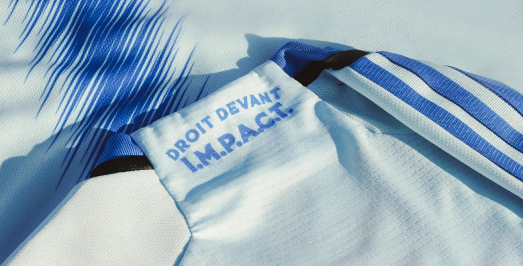
Blue stripes on the shoulders and piping along the sides and black and blue on the neck and cuffs add to the appeal of this elegant jersey. Meanwhile, the back of the neck has a portion of the club’s motto “DROIT DEVANT,” which translates to “straight ahead,” over the anagram “I.M.P.A.C.T.”, which are a callback to CF Montréal’s original name and stand for the club’s values: Inclusivity, Memory, Passion, Ambition, Collectivity and Talent. In addition, five symbols from the City of Montréal flag and coat of arms serve as the jock tag. Quel beau maillot!
Any surprises? Now we are down to the Top 10. Do you think any of the kits in this tier belong in your Top 10 or lower?
(All images are the property of Major League Soccer)
Related Post
What’s Old is New Again
By Edgar Zuniga The official release of the 2024 MLS Archive Collection kits on July [...]